The importance of a landing page cannot be underestimated. They should be an integral part of every online marketing campaign because they aid greatly in conversion.
Websites have to be built to cater for many different situations. You can never tell who is going to land on your site, and you never really know what they’re there for. When designing and building sites, therefore, you have to be a bit of everything for everyone.
There are courses of action which you might want to highlight over others, but you still have to keep every possible option in mind. The last thing you want to do is get a potential customer to a site and lose them because you were trying to push something else down their throat.
A landing page, on the other hand, offers you a path to a luxury that is usually reserved to quasi-individual communication. You can reserve landing pages for very specific paths of entry and then prepare content that is targeted specifically to the audience you know will be landing on that page.
Have I lost you yet? I probably have, however it all becomes clearer with a small practical example.
Imagine I was selling fruit and vegetables on my website. When I’m building a website I can’t really tell what people want when they get to my site. I can, very broadly, assume that the people who land on my site want to top up on their greens. I could, to a certain extent, safely guess that my ideal customer is potentially interested in living a healthy lifestyle, but these will all be broad assumptions.
So I could decide to build three separate landing pages to be used when I’m linking to my site from a variety of sources.
- I could build a landing page with the advantages of buying fruit and veg in bulk from my store for chefs – indicating how my prices are competitive for business to business sales.
- My next landing page would target people who are after a healthier lifestyle. I could extoll the virtues of eating fresh produce. This page will also highlight the fact that I’m sourcing greens from local farmers.
- My final landing page would be aimed at party-goers who are looking for the only source of fresh lime in the area. This would be a page giving various Mojito recipes and promising a free sprig of fresh mint with every lime bought, only as long as you mentioned that you were buying the lime for mojitos.
So now that we’ve understood why we need landing pages, we need to try understanding what helps make ones that work better.
Set your marketing goal
Before you can even start planning what you want your landing page to look and feel like, you need to have a marketing goal set in your mind. It is imperative that you stick to one particular aim and resist the temptation to try solving more than one issue at once.
Remember, the whole point of going down the landing page route is to gain an advantage over the rest of your site by being specific, so don’t try to cram more than one goal. You can’t build a landing page that will gather data, sell, go viral and clean your dog’s droppings.
Choose an action
Once you have a marketing goal in mind, you need to translate it into an action that visitors can take once they arrive on your landing page. Copyblogger quotes Seth Godin’s five courses of action that can be offered to people who arrive at your marketing materials online:
- Get a visitor to click to go to another page
- Get a visitor to buy
- Get a visitor to give permission for you to follow up by email, phone, etc.
- Get a visitor to tell a friend
- Get a visitor to comment or give you some sort of feedback
Identify the benefits for your visitors
Most traditional marketing focuses on features. It is quite understandable – the go-to source of knowledge usually lies within product development, so it’s natural for them to flaunt their feature-set.
Buyers, however, only really delve into features when they’re in a far more advanced stage of the purchase life-cycle – essentially when they’re choosing between a small set of products they’ve identified as potential choices.
Before then, all they’re really interested in is how the product or service is going to make their life better, ideally in a tangible way. Sometimes your list of benefits needs to sell the need of the product itself – so our friendly green grocer might want to show the advantages of living a healthy lifestyle in order to drive more traffic into his store.
If, on the other hand, the fruit and veg man was operating in an area where people are generally health conscious, then he’s probably competing with quite a few other similar businesses, so the benefits he has to highlight are specific to his place and the produce he’s selling.
Stick to the message
The big difference between a landing page and a regular website is that you are allowed to be far more specific on landing pages. If you have a hundred products or services, this is not the place to be shouting about them.
People came to this landing page for one specific reason. If you’re doing your job well enough, people came to this landing page from one specific source. So make sure that all you do is make it clear that you’re there to help them solve that specific need. Landing pages are not the place for cross-sell (unless cross-selling is your only aim for the landing page).
If we built a landing page for party-goers, convincing them that we’re the best source for lime and mint to base their Mojitos on, then there is absolutely no value in extolling the virtues of living a healthier lifestyle or losing weight. They’re not here for that, so don’t distract them from their main aim. Make the best of the few seconds you manage to get their attention for and get them to order their mint and lime.
Write clear and concise copy
People are busy. People are very easily distracted.
Keep your paragraphs short and your sentences even shorter. If you can get away with one sentence instead of two, do so. If you can get away without any body copy at all, then by all means go for it.
This will obviously depend on what you’re selling. Some products or services demand longer explanations and punters will demand reassurance, but always go through your copy and ensure that you’ve removed all the extra fluff.
Before you start, read The Elements of Style, by Strunk and White (first edition available for free here and the second here (PDF)) – you’ll get a lot out of it, but it is worth the read if only for this paragraph:
“Vigorous writing is concise. A sentence should contain no unnecessary words, a paragraph no unnecessary sentences, for the same reason that a drawing should have no unnecessary lines and a machine no unnecessary parts. This requires not that the writer make all his sentences short, or that he avoid all detail and treat his subjects only in outline, but that every word tell.”
Reassure people that they’re making the right decision
Visitors to your landing page need to be reassured that they are in a place they can trust. And what better way to confirm this than by adding real-world testimonials, either from peers or from professionals.
If you can pull some words from a well-known and instantly recognisable review site, then definitely do so. We did this with the landing page for Corinthia Hotels recently, taking reviews from TripAdvisor and showing their (Excellent) rating amongst one of the first things on the page. This has a much higher impact on visitors than simply stating great things about your product yourself.
If you can use social proof, then do so too. There are many ways of inserting live information in your landing pages, maybe simply by showing how many people are actually on the page, how many people have used the service recently or just the number of followers you have on Facebook or Twitter. A Facebook Page Like box is great because it even shows which of your friends have already liked the page (and therefore your brand by extension).
Make it easy for people to take the right action
So now you have your goals set up and all your content written perfectly. People who get to your landing page are more likely to believe in your product or service because you’ve given them good reason to.
So what do they do next?
Their next step should be immediately clear. It should be very easy for them to take it, it must feel natural, and it should leave no doubt in their mind as to how the action should be taken.
You should have chosen your goal in the beginning, now’s the time to achieve it. If you want email subscriptions, then don’t put buttons all over the page asking people to buy your products (just in case they want to buy after all). You’ll confuse visitors and waste money on the traffic you generated to the landing page.
Keep any forms you place on the page short and to the point. Only gather the information you absolutely need from your clients – this is not the time to profile your visitors, this is the time to open a line of communication.
Test the page on people who have no idea what’s going on, see if they find it as obvious as you do what their next action is. Try asking people you know who are close to your target demographic – no use asking your tech-savvy colleagues to test a page if you’re aiming it at retirees.
Test, Measure, Tweak, Repeat
So now you have a landing page that’s done – time to go out and celebrate? Nope, I’m afraid not. This is when your hard work starts. Now you have to create multiple variants of your landing pages and start using them to slowly but steadily improve your numbers.
We’re back to our starting point – tweaking content. This, however, is where we change our content subtly depending on the source of our traffic. It has been proven that conversion rates improve if you use the same verbiage as people’s searches. Using the right keywords in landing pages also improves your relevance, and therefore gives you more brownie points with paid search traffic.
So test variations, measure their impact, teak your tests and repeat the process until you’re running a well oiled conversion machine. Good luck!
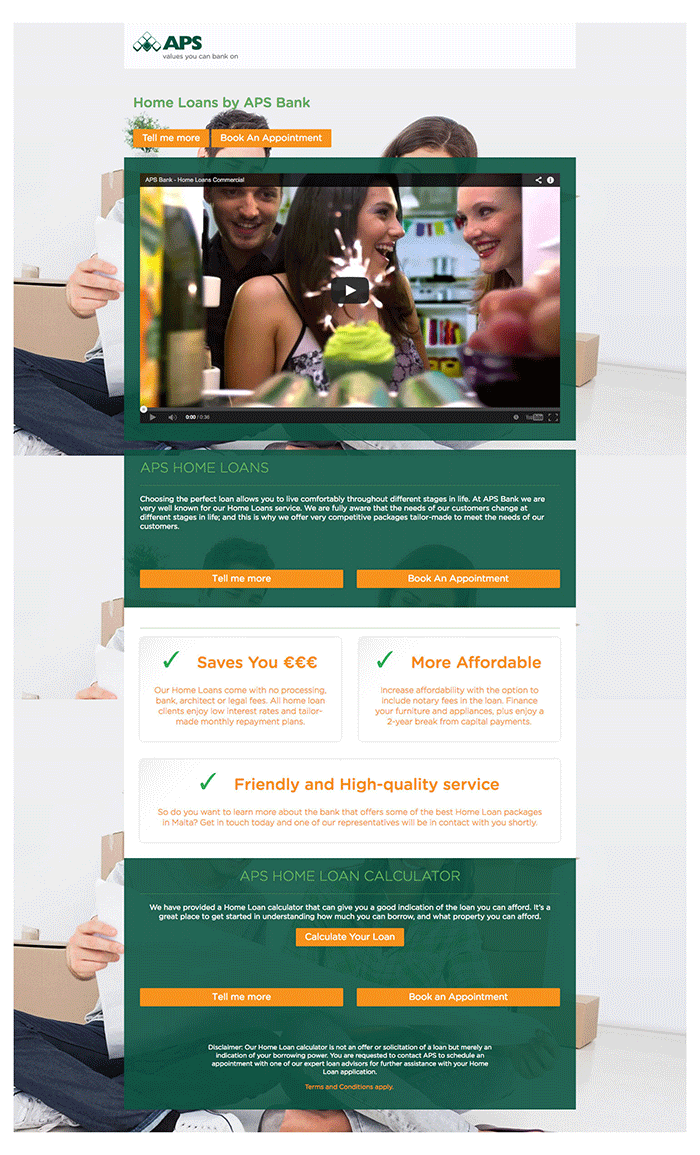
The screenshots below shows two examples of landing pages we did for APS Bank and Corinthia Hotel London.


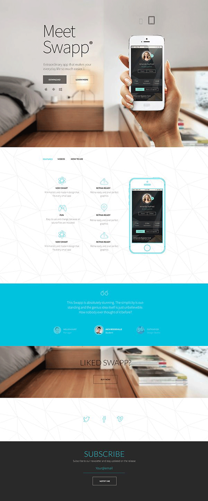
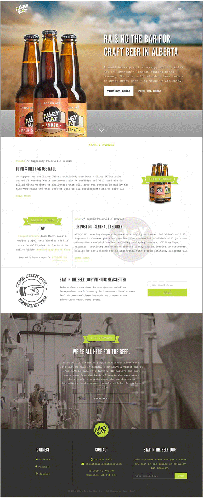
Other examples:


Do you think that your business could benefit from better landing pages? Why not drop us a line at [email protected] to see how we can help you increase your online presence and ROI?


