The Secret Rose needed a brand identity for packaging. We worked with the visionary behind the brand to create one.
The Brief
The Secret Rose already has a brand: patient, classical, and timeless. It has a voice: slow, methodical, and dedicated. What it needed was a clear, visual marker that could go on packaging, fabric tags, ribbons, and on projects in the future. As the Secret Rose continues to grow, the necessity of having a memorable visual identity becomes fundamental.
However, the Secret Rose’s owner and main creative is an artist themselves, and any identity created had to be collaborative.
The Work
Every branding exercise starts with why the brand exists. For the Secret Rose, the purpose is clear: The Secret Rose exists to create beautiful things, sentimental things, and things that stand on their own as a testament to aesthetics. Every object that is made at the Secret Rose is handmade from high-quality materials, and it takes time and patience to create even a single item. The driving force behind the Secret Rose’s popularity is that low-volume, unhurried approach to creating products, where detail and perfection thrive above sales.
The brand’s artistic director underpins each creation with precision that rivals machinery, allowing each piece to be recognisable as belonging to the Secret Rose while maintaining the handmade tenets of it.

The Outcome
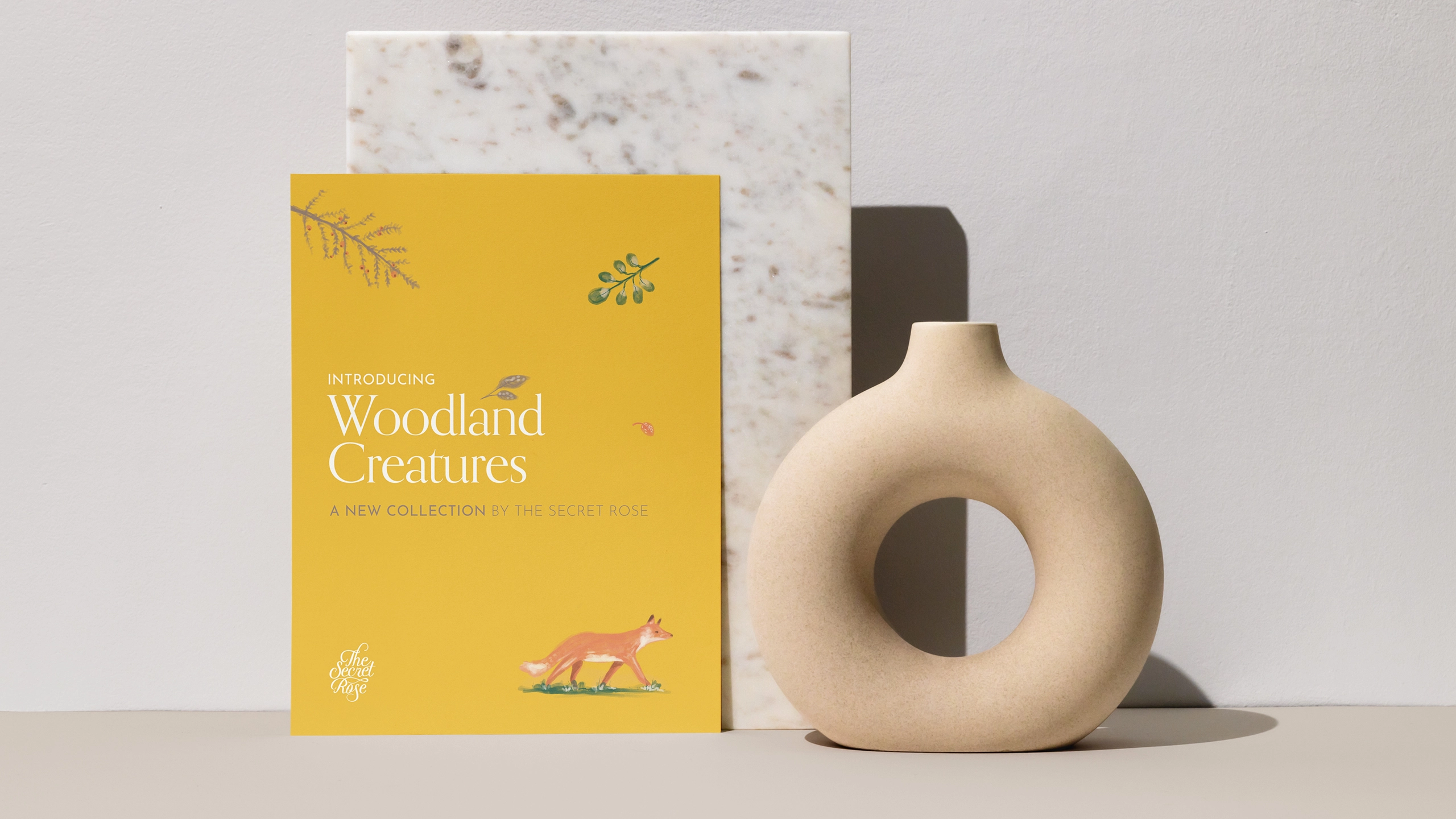
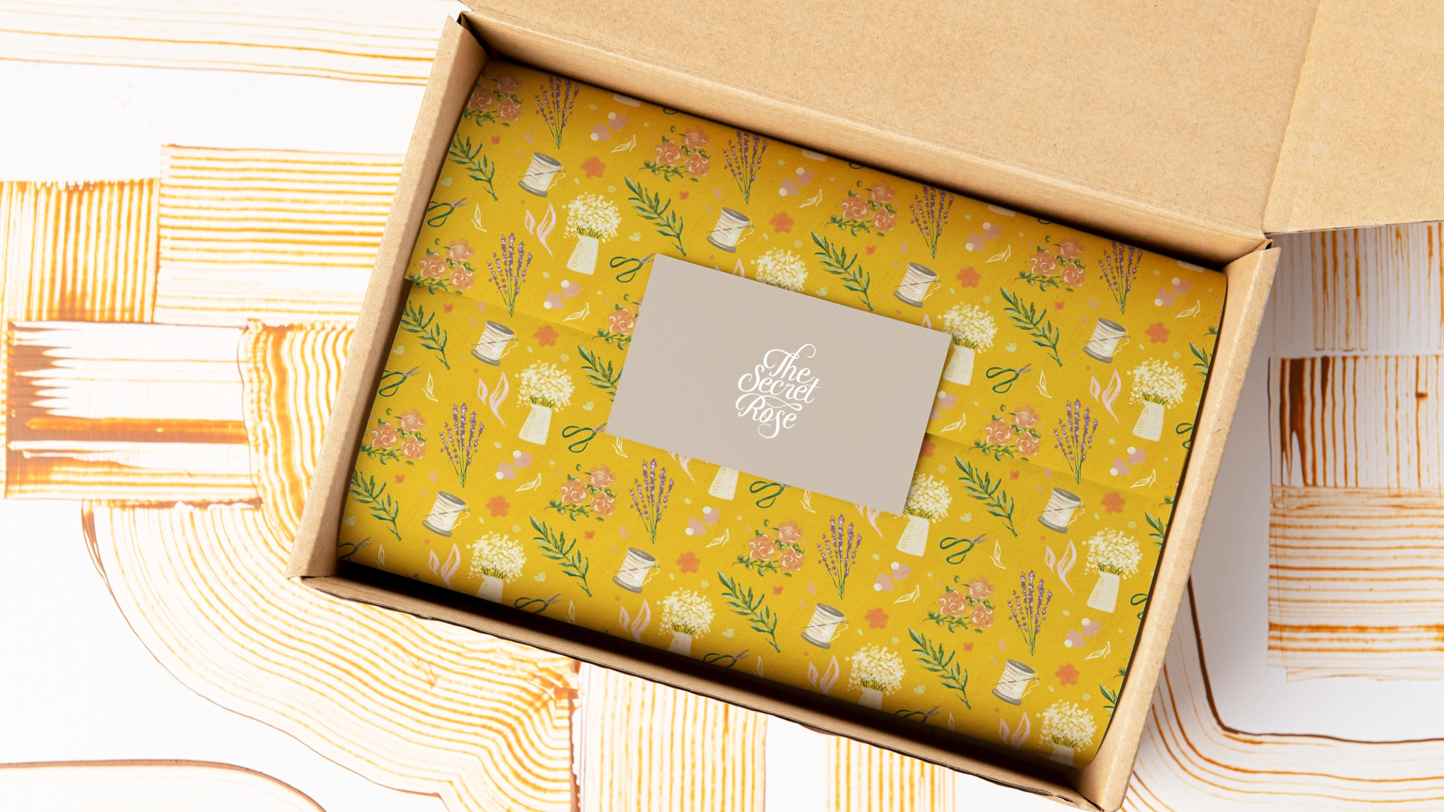
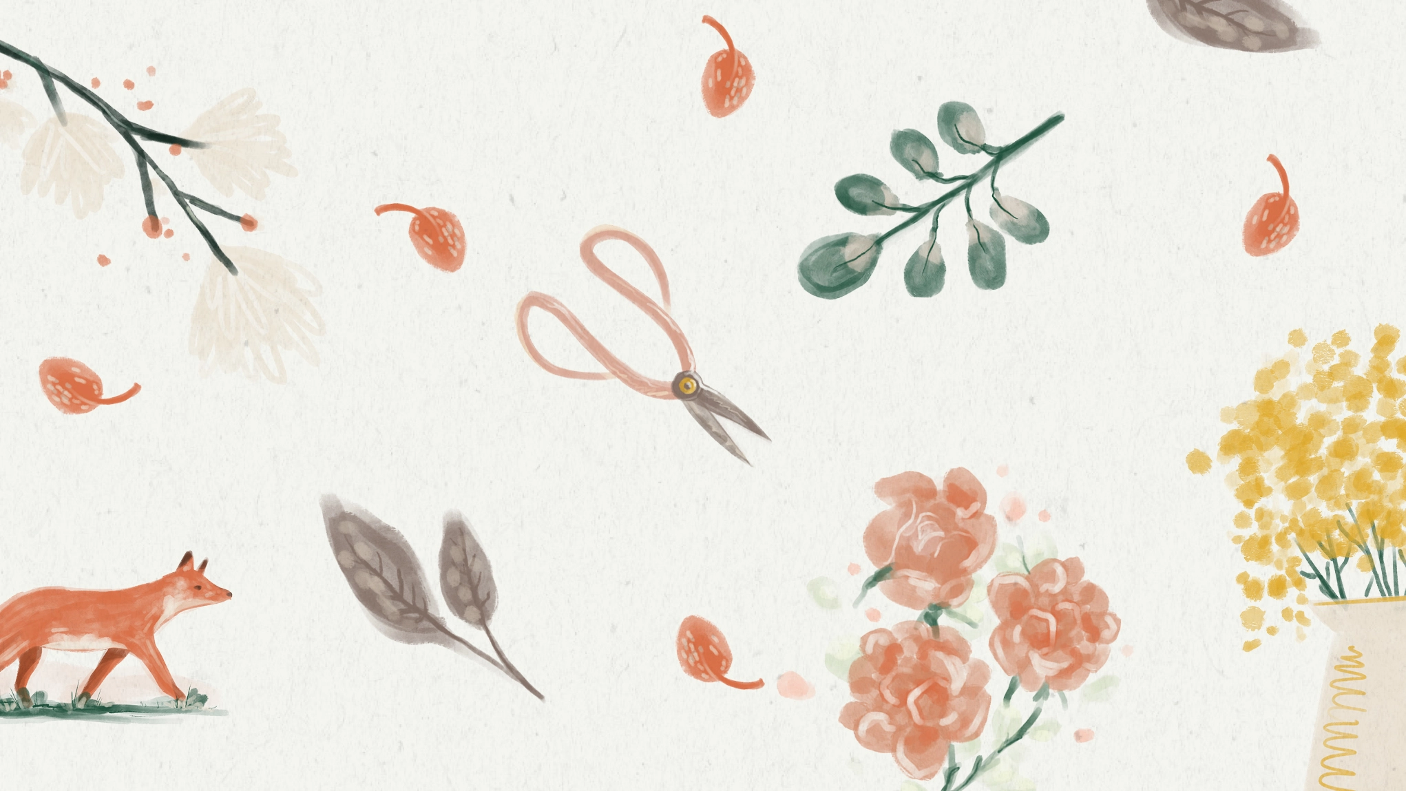
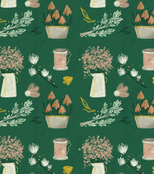
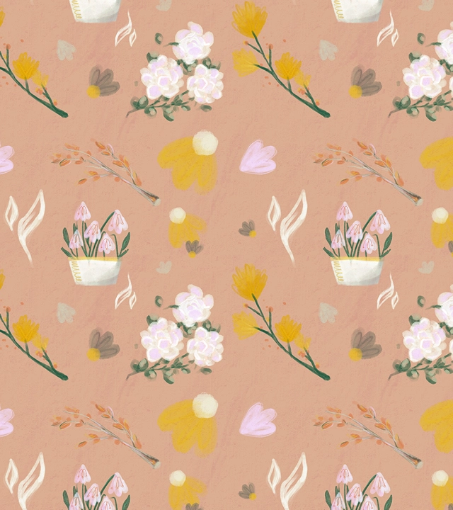
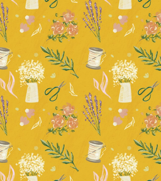
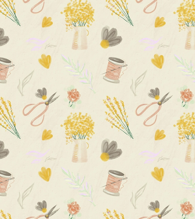
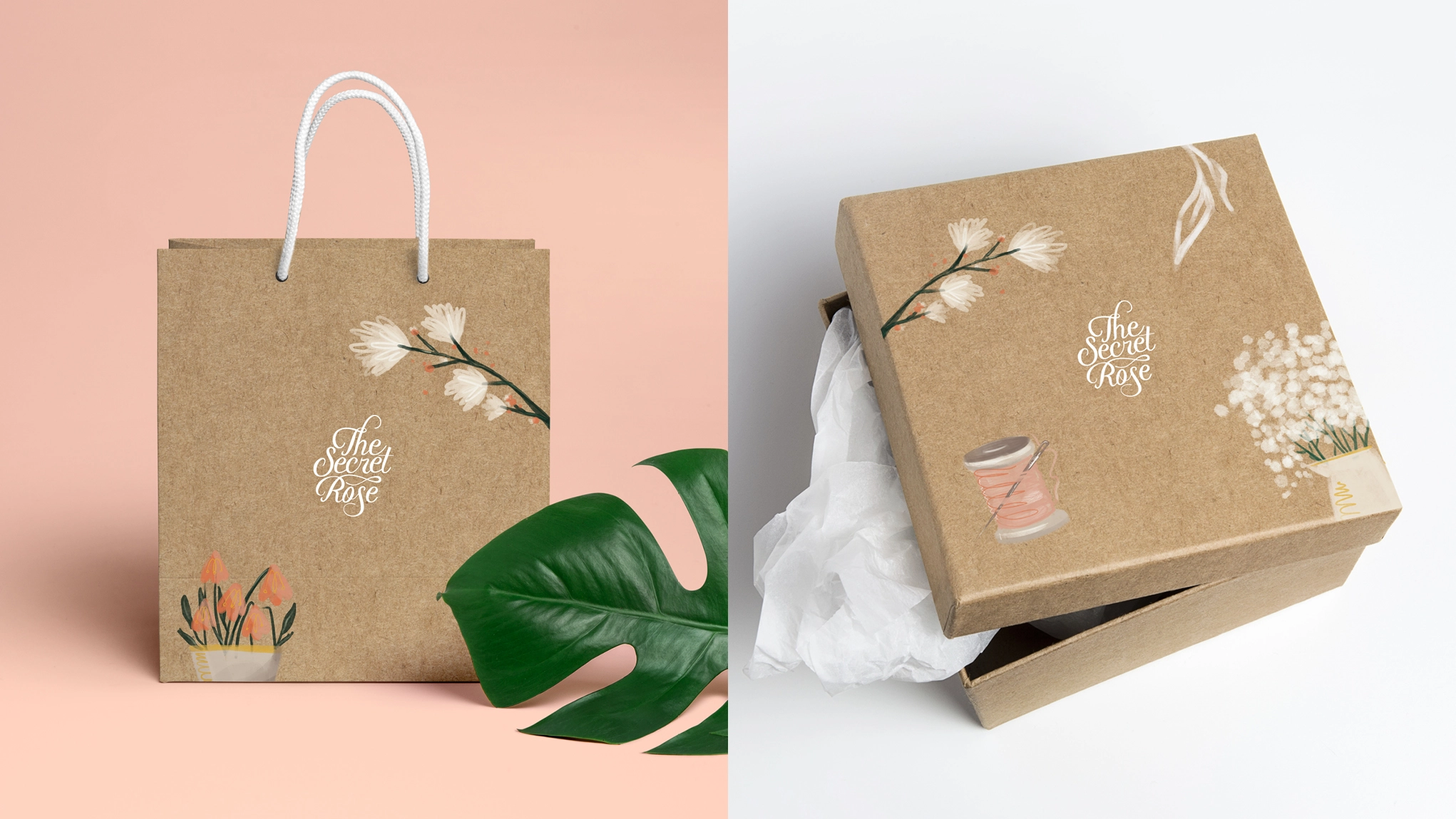
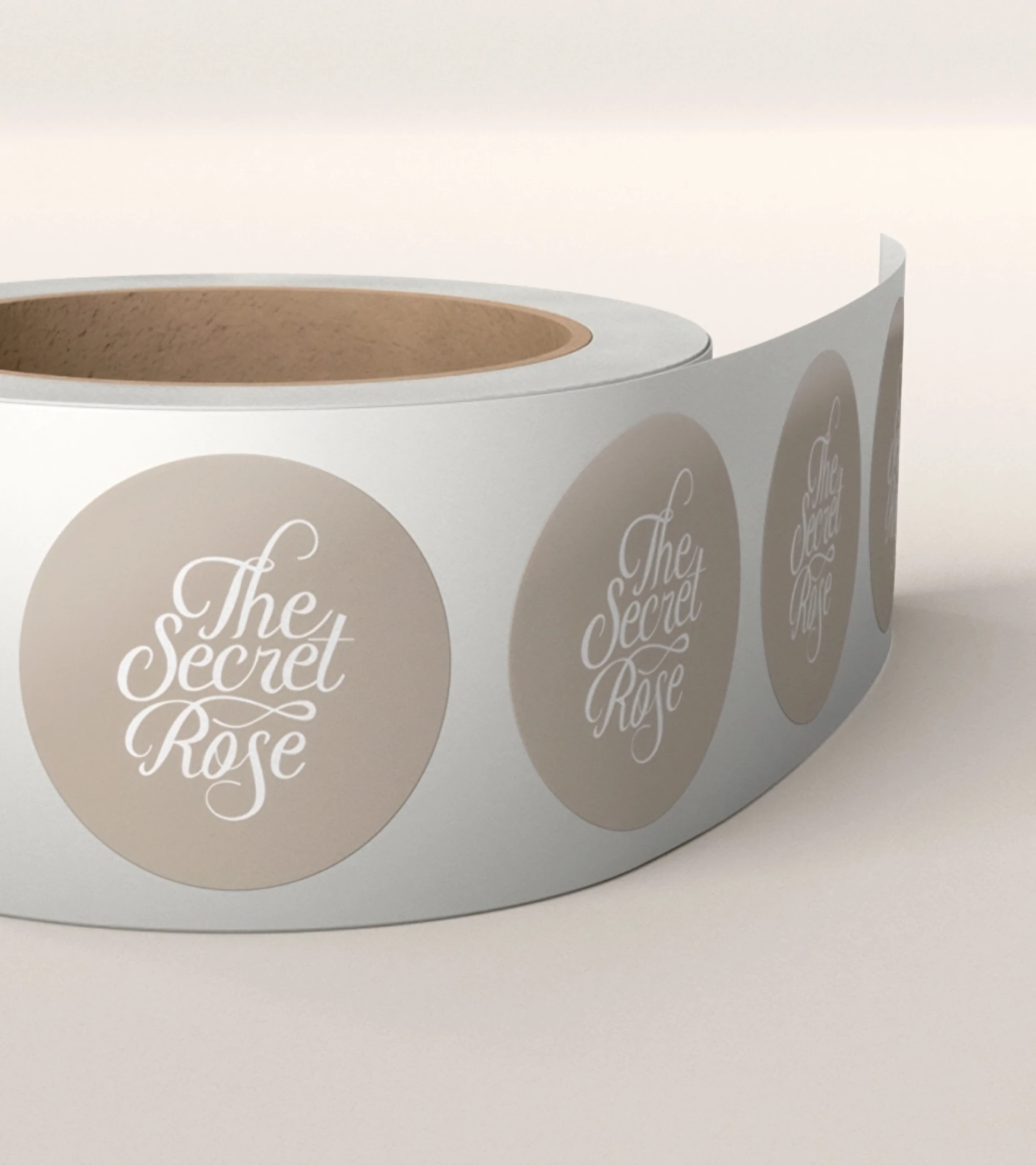
We focused on soothing, soft colours that learn hard on natural, earthy ones: cream, sage, terracotta, brown. We wanted to create a tie-back to the Secret Rose’s products, something that would echo the materials that The Secret Rose tends to prefer: gleaming thread, natural cotton, white wooden frames.
We opted for soft, curving shapes and a floral motif to bring out one of the Secret Rose’s favourite, hand-crafted elements, and to work in the connection with greenery and the natural world that the Secret Rose inhabits, where aesthetic and natural beauty reign. The Secret Rose’s products live in a world outside trends and popularity, transcending the moment to become timeless, and we wanted to create an identity that would also maintain the same balance of the classic and the artisanal.
The Results
Our client says: