In our recent post on Tips for creating your Facebook Cover Photo, we went through the Top 10 dos and don’ts to keep in mind when designing a killer cover photo. Sometimes, however, a list of instructions can hinder your creativity rather than help it along.
Sometimes, all you need is a little inspiration to get those juices flowing while keeping the best practices in mind.
Here are 10 well-known brands who consistently produce excellent cover photos, whether it’s to promote their brand, a new product or a one-off event.
Take note: They tick all the best practice boxes without compromising on beautiful design, and that’s a winning combination.
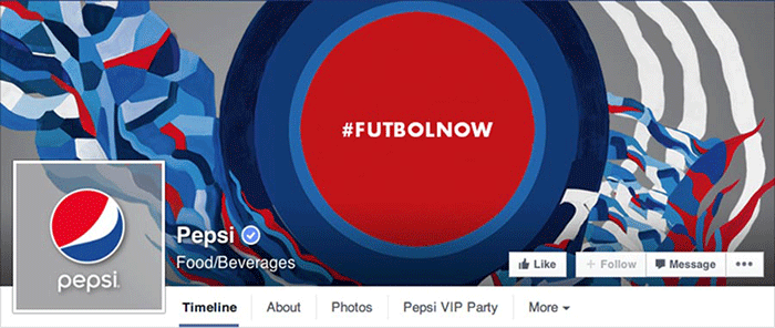
10. Pepsi
Why hello, hashtag. Pepsi use their signature funky, urban designs to direct all attention to their star hashtag of the World Cup season. With Pepsi-sponsored football players using the tag all over the internet, it was important for Pepsi to advertise the hashtag and encourage people to look it up. Plus, they integrated the profile picture into the overall design, which always looks clever.
Why is this at the bottom of our list? Well, they didn’t include the clickable hashtag in their description (or any description at all, for that matter), meaning that they’ve lost a golden opportunity for driving traffic.
9. The New York Times
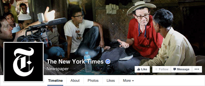
Sure, you would expect a leading newspaper to have striking footage and photography to use on social media. But the New York Times takes it a step further. Here they’ve given visitors a behind-the-scenes look at what goes on during an average day of work, instantly boosting credibility and interest. And all of this without using a single word of text.
8. GoPro
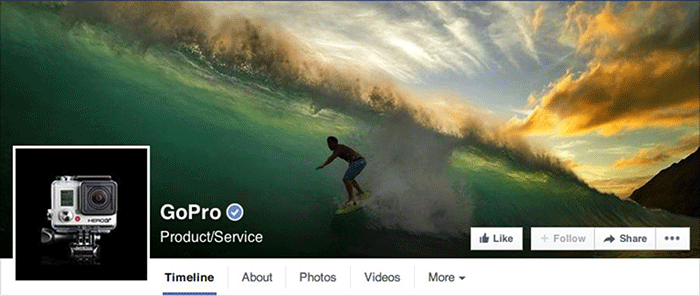
A simple sales message, delivered powerfully. It’s understood instantly: If you buy a GoPro, you can capture this sort of image.
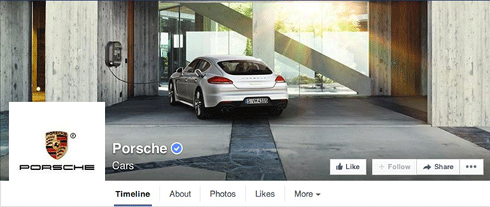
7. Porsche
It’s similar in concept to what GoPro did with their cover photo, but Porsche went a step further. Rather than posting a random pretty picture of a car, they showcased their latest advancement in the field without using a single word: Electric motor engines.
(and yes, they did provide a link in the description.)
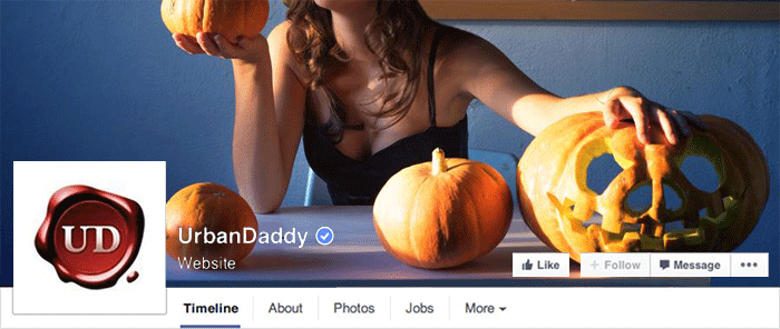
6. UrbanDaddy
If you’re a fan of superb copy skills, you would want to look into UrbanDaddy. Their cover photo is exceptional at reinforcing their brand, but with subtlety. The image doesn’t loudly promote their product (which is content and offers on their online magazine). Rather, it’s all about the person who reads UrbanDaddy and the lifestyle they represent.
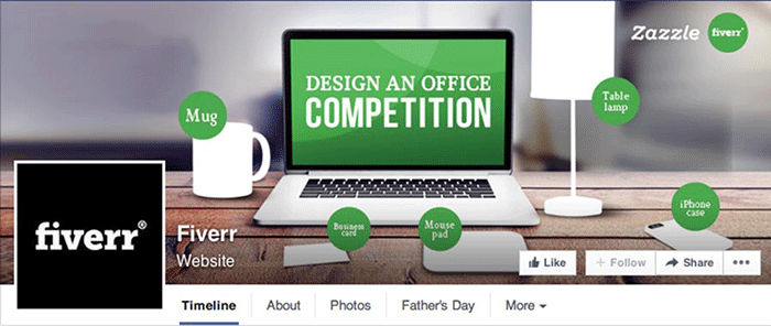
5. Fiverr
If you stick to the guidelines and keep things simple and looking great, you can use your cover photo to promote anything. Just like Fiverr did. They’re promoting their current competition and getting the entire message across without using too many words in the design. The competition looks simple and entices you to find out more – and they haven’t even told you what the prize is yet.
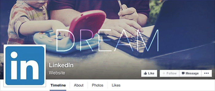
4. LinkedIn
You hear ‘LinkedIn’ and you think business professionals and overall seriousness. The last thing you’d expect to see on their cover photo is a toddler playing with a toy laptop – but that’s exactly why it’s brilliant. They’re showing us that they appreciate the users behind the millions of business profiles, the users that go home to their kids after a day at the office. They’re giving a stuffy network a human face, all with just one image.
3. Amazon
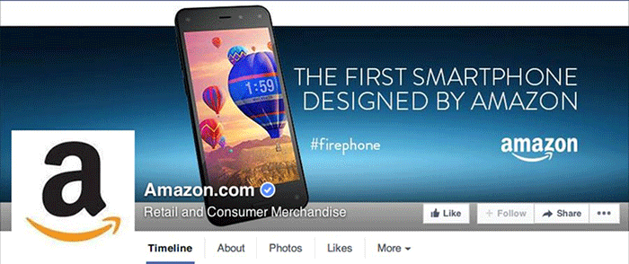
Simple and direct – Amazon are showcasing their latest product. No need for pricing or product details, that will follow. All they’re doing is building awareness and fostering curiosity without having to pay for advertising.
Plus – spot the hashtag.
2. Sony
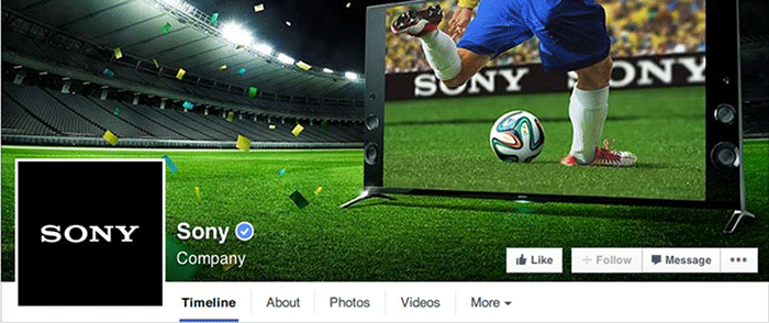
It’s current, it’s evocative and it’s visually striking. All Sony have done is show how their product is relevant right now. They posted this one during the World Cup, so football was the first thing on everyone’s mind. By (literally) placing their product in that scenario, it leads people to think that the next logical step would be to upgrade their current TV to the one in the picture. Or at least, that’s what I thought.
1. Facebook
At our number 1 spot – who else?
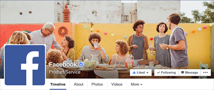
There’s nothing obvious about the message behind the photo. That’s for you to interpret. But the chances are that, with an image like that behind the blue Facebook logo, you’re thinking that Facebook had something to do with bringing all those happy people together, regardless of age or ethnicity.
Bingo.
Now over to you – how do you make Cover Photos work for your marketing?


