Fair warning, this is a relatively long read. If you don’t have the time to take it all in now, you can download the PDF version of our 2023 Web Design Trends for free by clicking below. Otherwise, just keep reading!
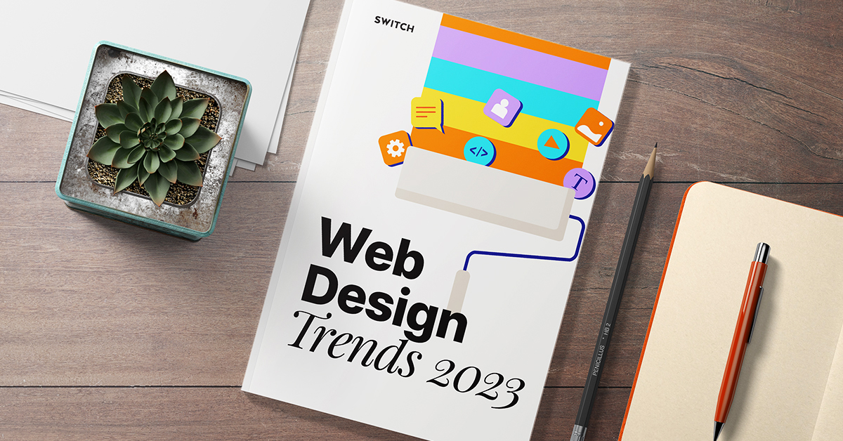
94% of the first impression any client gets about a brand website comes from web design.
Immersive imagery. Playful shapes. Moving elements.
Web design has come a long way from the flickering, pastelly brightness of the nineties, the tiny-text minimalism of the early 2000s, and the sleek rebrandings of the late 2010s. We’re looking at websites now that fulfil a function far more than just a place to park your brand and hope for the best: we’re looking at websites that exist on their own merit as an essential pillar of your brand’s personality.
This is not new.
What is new is this: we have social media platforms that now struggle to maintain the same level of engagement as they did previously. Facebook, Twitter, Instagram, and Tiktok are all inundated with their own issues, and so a greater proportion of brands are turning to older ways of communicating with their consumers.
That means websites. It means forums. It means web design.
For 2023, we’re going to see more websites.
Here’s what they’re going to look like.
What’s here to stay:
Vanillafication
Some people might not have a fully-kitted out desktop or laptop computer.
But they will have a phone.
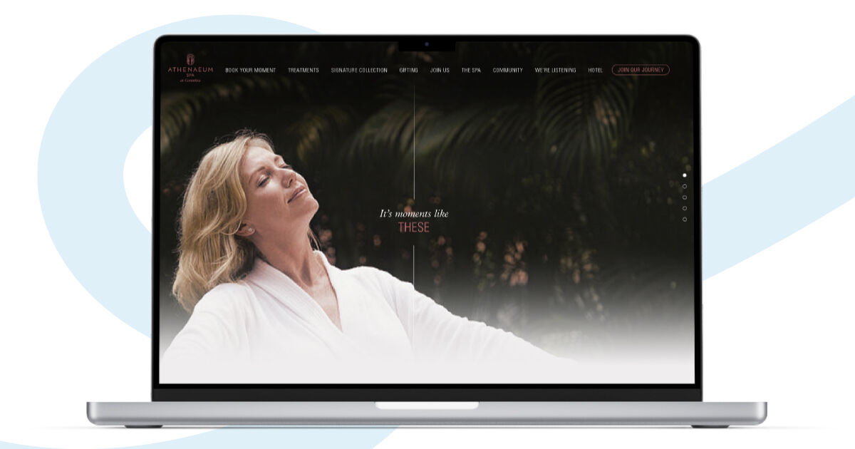
Websites that prioritise clean, effortless aesthetics that load fast and look good are poised to see an even greater boost as consumers’ shrinking attention span means they will pivot away from any brand website that takes ages to load on the device they use the most: their mobile phone. The age of instant gratification and hyper-speed responses is only giving rise to faster websites, and in 2023, speed is going to be an increasingly important element in web design.
Inclusion through typography
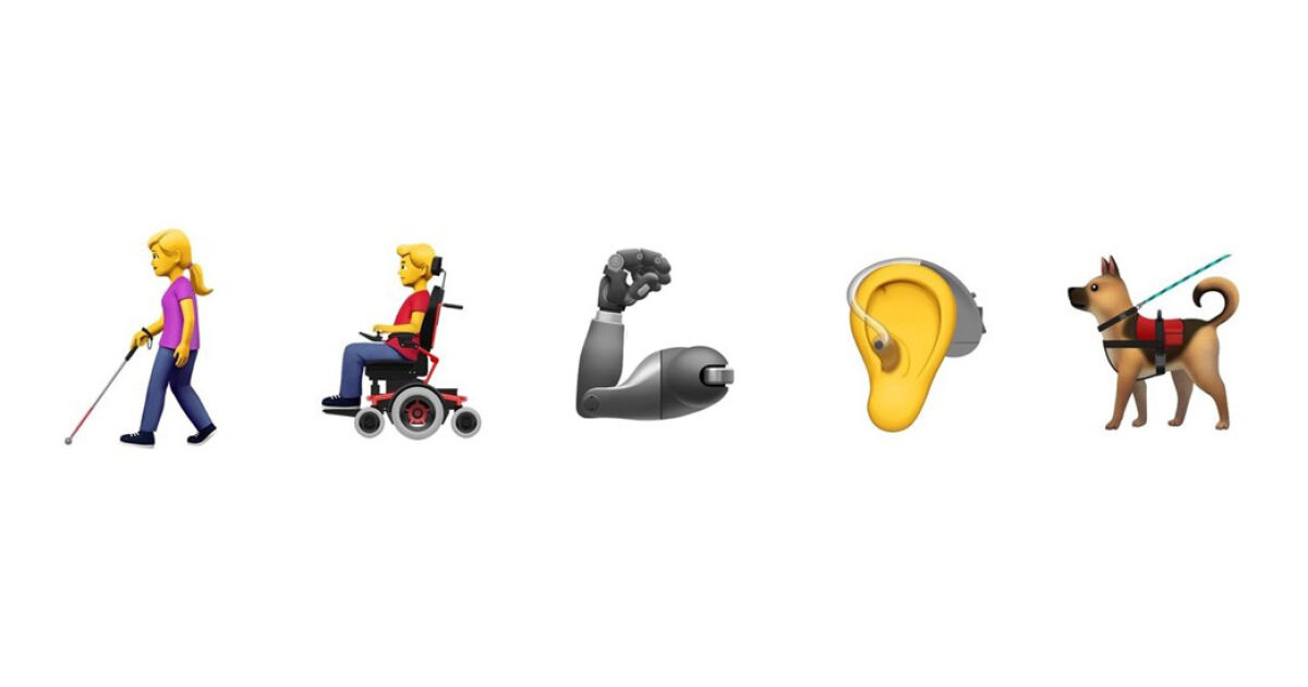
2022 showcased some excellent advances in typography: from 70s-inspired curls to user-set sizes, typography gained new importance as a unifier across all capabilities. Adaptable colour schemes, alt-text, keyboard navigation, and captions will see a greater focus in 2023 as companies strive to create a more inclusive internet experience for everyone.
The Return of Experimental
Web design can be fun.
In 2022, websites that introduced an element of enjoyment to consumers did well, and in 2023, it won’t be any different. Bold colours, beautiful typography, and stunning animations still draw significant attention, and with the growing return to the nostalgic, websites in 2023 can really benefit from turning the clock back to move forwards.
Trends 2023
It’s not all about the past.
2023 is looking forward to a bright future.
Here’s some of the highlights.
1. Hanging a(round)
Sharp, angular lines aren’t going anywhere. The days of brute minimalism are still on us.
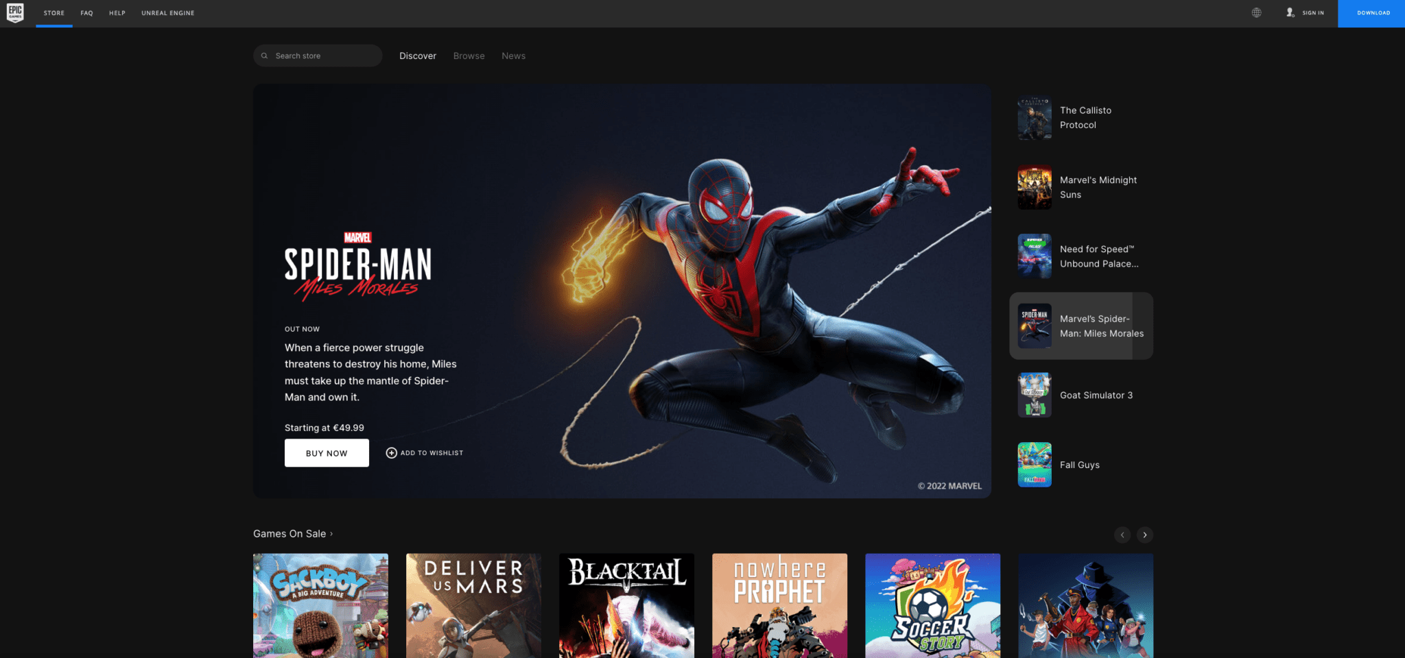
However, more and more platforms are opting to take their sharp edges away and replace them with squovals, squircles, and rounded corners. Google and Youtube have already hopped onto the circular see-saw, and with Google and Youtube settled as two of the platforms used daily, we’re likely to see this trend cropping up in other websites sooner rather than later.
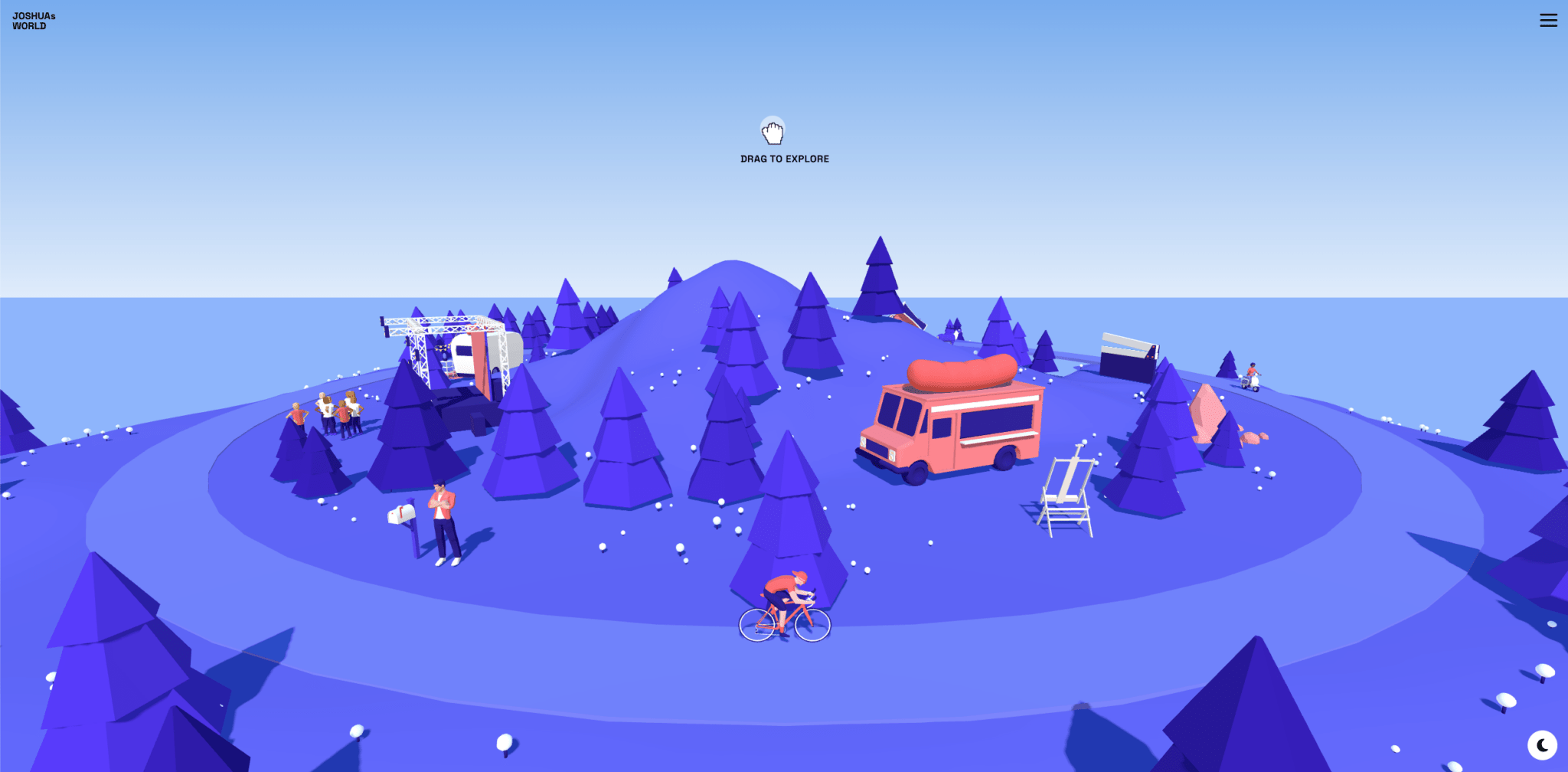
2. Micro-interactions
We’ve already mentioned micro-movements.
This is a step beyond that.
Consumer attention spans are growing shorter. Their focus is narrower.
The web is huge, noisy, and chaotic, and it’s only getting more so as brands try and grab hold of as many consumers as possible – and they’re trying to do so by injecting their websites full of character and expression.
Beautiful imagery. Text that sings.
Animation.
A little animation goes a long way towards connecting a brand and its audience. Throw in ‘hidden’ animations – ones that only appear when the consumer interacts a certain way with the website – and you can definitely see repeat visits from your closest fans.
According to Andrea, our lead designer, “gratifying animations can give users a micro-dopamine kick”, keeping them coming back to your website for the pleasure as much as the product. However, it’s important that all your animations don’t slow down the way your website loads. In 2023, speed is still the biggest factor for website success, and clunky, slow-loading sites that look beautiful will not benefit from any micro-interactions added to the site – no matter how expressive they are.
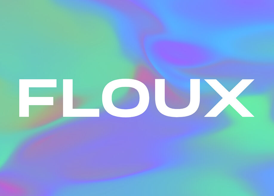
3. Interactive gradients
Whether you’re a fan or not quite sold on gradients, their presence in 2023 is undeniable: not only will we see more static gradient design, but websites that want to add movement to their site without limiting their loading speed may opt to add warping gradients to their page as a form of expression. For sites where speed is the greatest concern, adding animated gradients and shifting gradients is the best of both worlds: you’ll add character to your web design without limiting what your web page can do.
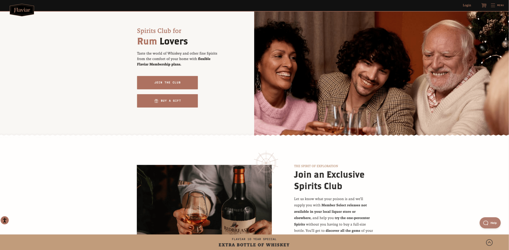
4. Lazy Loading
Think of your website as a book.
Your user can only look at one page at a time. Lazy loading is a way of making sure that that page – the only page that they’re looking at – loads up fast. The rest can come later.
Does it matter in the long run? It does if you’re a site with a lot of content to go through, particularly if that content is imagery, animation, or video. Your consumers only have milliseconds to decide whether or not they want to stay on your webpage long enough for it to make an impression, and lazy loading will keep those precious milliseconds focused on the things that matter: the content that’s drawing your customers in.
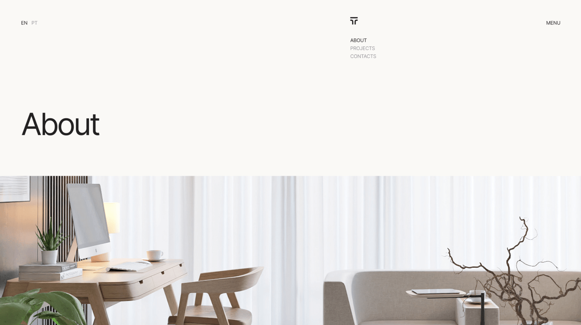
5. Reassuring Reality
The web is a global platform.
Some days, there is more bad news than good news to read about.
Web design can help with that. Keeping your web design light, your typography calm, and your users in control is a way of combatting the growing cynicism of the web – and no, it doesn’t have to be happy. People who go on the internet are used to having very little control over their viewing habits: from GDPR to hiding the unsubscribe button in typographic loopholes, hostile web design to keep people pinned to the page or the brand is not new.
But it’s no longer the norm.
Calming calls to action. Visible controls: unsubscribe, increase the text, remove all tracking.
Andrea says, “the web has the duty of making its audience a little calmer, but it’s not about whimsical, on-the-nose, super-happy illustrations or animations: that’s a sign of cynicism. But we’ll see the trend of letting users know that they are in control.”
6. AI-bstract imagery
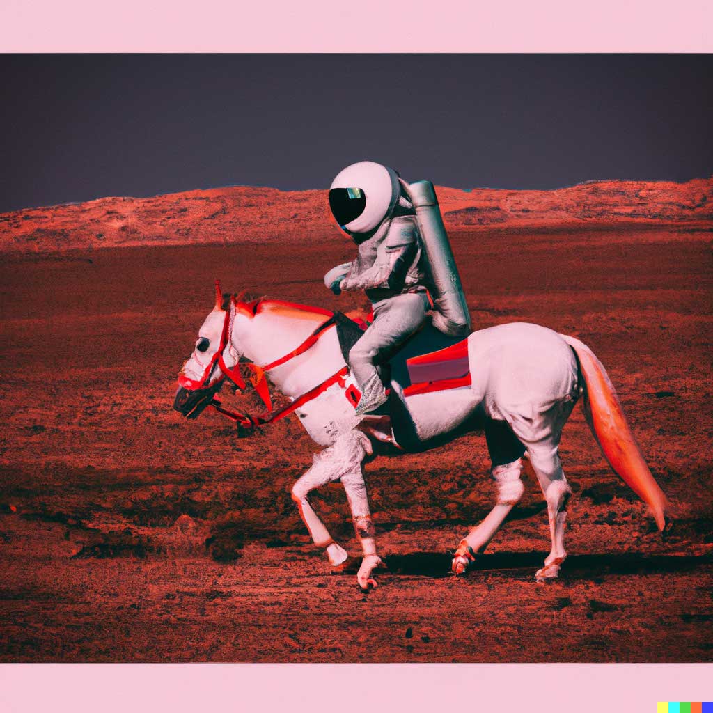
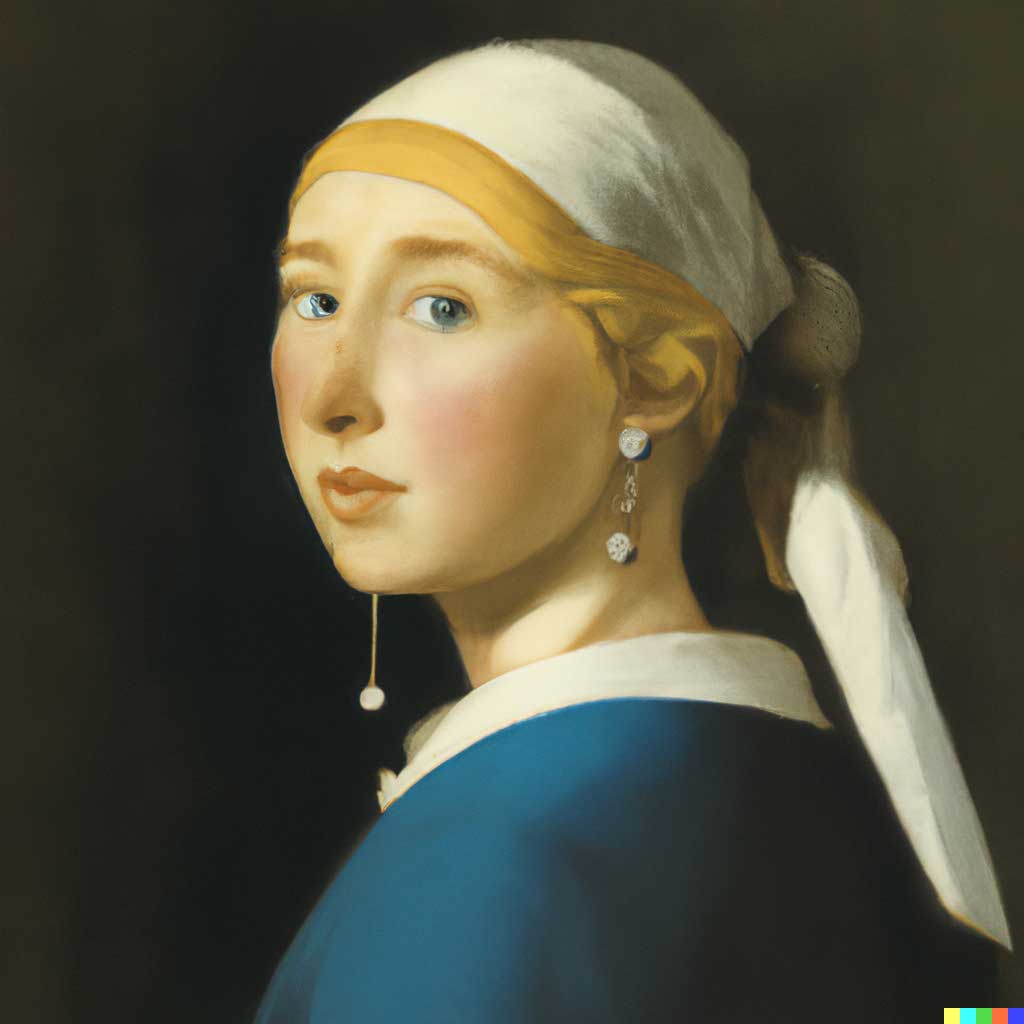
AI-generated art sparks a lot of opinions on both sides of the argument.
But it definitely has its place in web design in 2023.
Partially, it’s because we’re still in the early stages of refining AI art generation. Partially, it’s because it’s an innovation to the art world that has opened up access to creation to people who don’t have the technical training for art or design.
Either way, AI art has a distinctive uncanny-valley style to it that web designers can use to their advantage. From strange proportions to questionable colour choices, AI-generated art can be an interesting stylistic choice for brands that want to set their opinion down on a controversial topic – and for those not in the know, it’s setting a style that can quickly set them apart from the rest.
7. AI Know You
Your online experience is unique to you. What you watch, what you read, and what you look for is going to vary – and AI can bring it all to the forefront.
What AI can do is still in its infancy. AI can be taught to create experiences that change depending on the person who views the advertisement, but it will take time before it’s ready to make these changes.
DALL-E was a taster of what can happen when AI is made available to the public.
Now we can build on it.
Andrea says, “the next step for AI is to have it actually create on-demand virtual experiences: for example, Google knows what I like and what I don’t like, and tailors my advertisement based on that knowledge. Tone of voice, imagery, vocabulary use – even pop culture references – can all be tweaked to create content on the fly.”
8. 3D Dreams
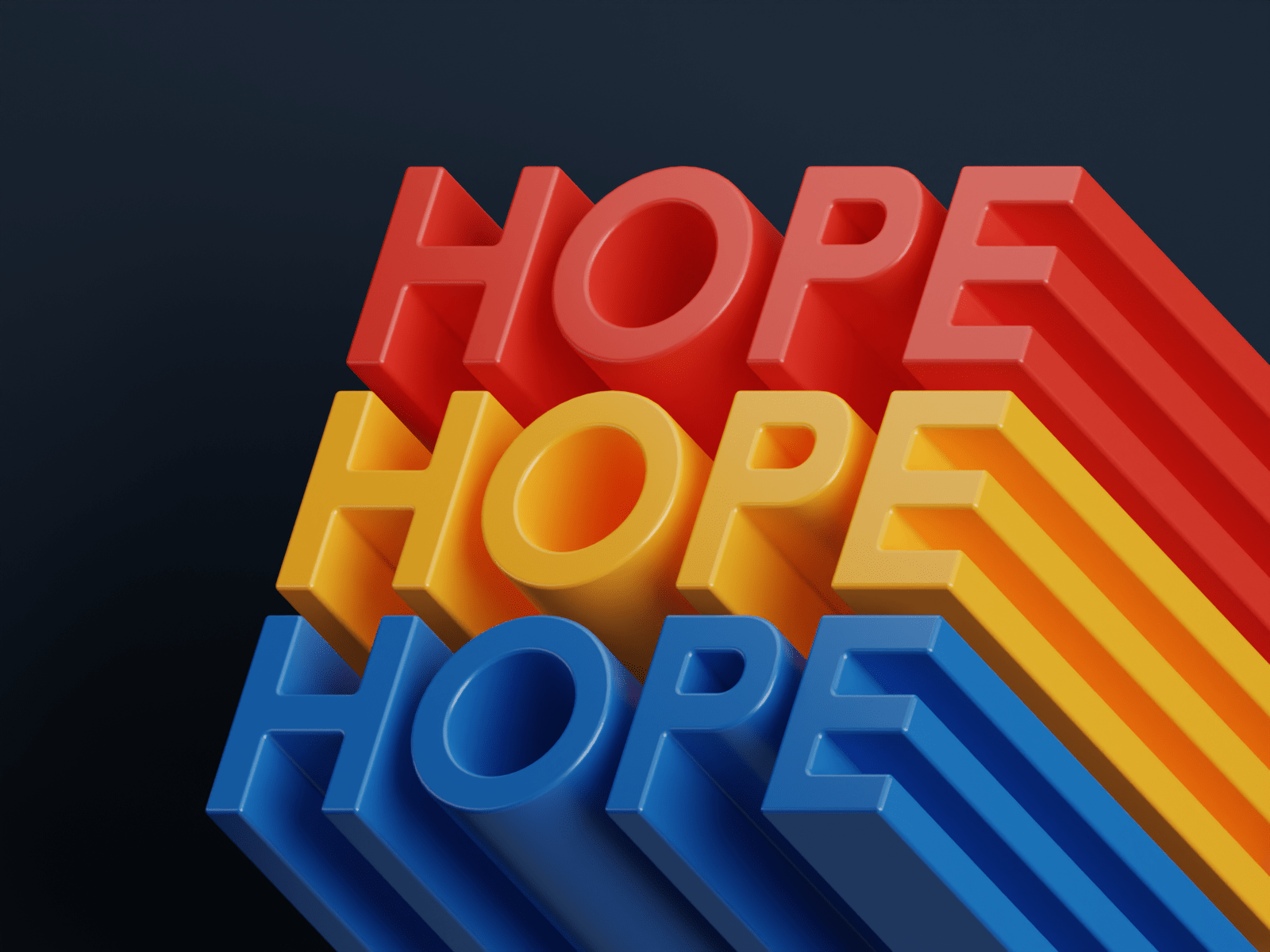
In 2021, a living billboard caught the attention of pedestrians in Shinjuku. In 2022, more animated billboards took over public spaces: Times Square, Piccadilly Circus, Shenzhen.
Websites will see more of the same: images that seem superimposed on your screen depending on how you tilt your phone. Images that follow you. Text that seems to stand apart from the rest. While the technology is relatively new, consumers are already used to images that stand out as larger than life, and careful use of 3D imagery can only add to an immersive experience.
9. Frasurbane
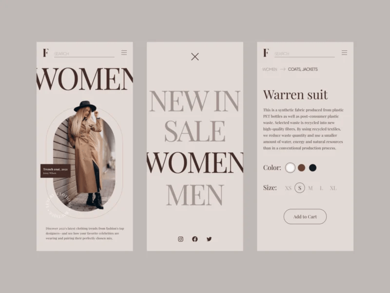
This is not a new trend – but it’s taken on new life in the latter half of 2022. Initially a 90s interior design trend, Frasurbane is all about beige and earth, softened elements that focus on muted colours and larger-than-life fonts. With the nineties and Y2K aesthetic already drawing focus to the possibilities of the past, it’s no surprise that Frasurbane is coming back as a design style – or that it lends itself so well to so many different brands. Add in the sudden turn towards natural and earthy design, and Frasurbane can inspire a lot of comfort to consumers looking for a brand that speaks to them.
10. Claymorphism
Life, larger: it’s a key component of design thinking in 2023. We’ve already mentioned 3D imagery, shifting gradients, and micro-movements.
Here’s another.
Claymorphism.
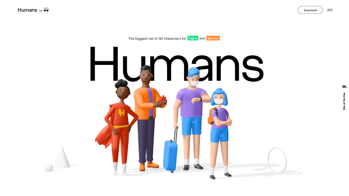
Think of the corporate design aesthetic from a few years back: the rounded shapes, the featureless faces. Now, make it 3D.
Claymorphism is pastel. Claymorphism is rounded. Claymorphism has depth and shadow, and it looks like it’s moving when you look at it. Web design in 2023 is seeking out movement and colour, and claymorphism is the best of both worlds: an aesthetic that both appeals and inspires.
11. Memphis Design
Here’s another blast from the past.
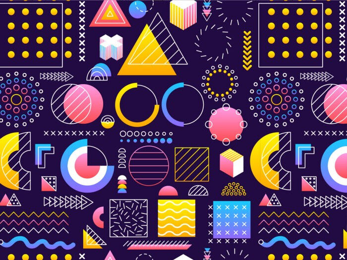
Memphis design originated in the 80s: the decade of cartoons, bright pops of colour, and repeating patterns. However, it’s not quite the same as what we’re used to seeing: it’s evolved into a sleeker, sharper version of itself where the colours are deeper, the contrast sharper, and the choices made more deliberate.
According to Sorina, “Memphis is much more than just a design trend, it breaks the typical norm and encourages freshness, creativity, and uniqueness through the design. Also, it motivates boldness and bravery, not just in design but in life, and reminds us that our time on this earth should be fun. Thus, it can actually help you deliver the best impression.”
2022 had plenty of reasons for us to stay understated.
2023 will not be the same.
12. Visible borders
For something completely different: realism.
But not for imagery.
Borders.
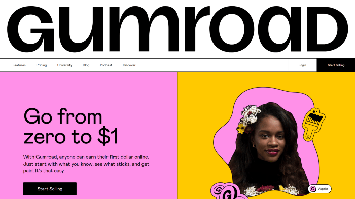
Websites exist in a virtual space, and that is an unavoidable fact. However, adding borders irons the website down flat, giving it an easier, smoother look for the easily-scattered consumer. The shrinking attention span we mentioned earlier? It’s aided well by borders and shapes that guide the eye along.
A lot of what happens on the internet doesn’t feel real to us. Borders are a way to help combat that unrealism and make the viewer more present.
Conclusion
For 2023, we’re looking at movement and our childhood, up in lights.
Design is past and present and future.
The trends we mentioned today aren’t the only trends you’ll see in 2023.
With so much of the world spending a growing amount of time on the internet, it’s no wonder that the internet we see now has started to resemble what we were used to when we were young. Nostalgia is powerful. For many, the web is still a place of comfort, even with the negative press around it.
Design trends will always reflect that.


