Web design is storytelling.
For a lot of brands, it’s the only form of storytelling they can have a little fun with. From glitchy graphics to hidden links to slow-scrolling pictures, web design enhances what’s good about your brand to mythic proportions. It’s the Willy Wonka method of storytelling, everything bigger and brighter and more beautiful.
In 2021, web design isn’t just storytelling; it’s crucial storytelling. Without a good website now, the losses aren’t even calculable.
And that’s without taking into account the fact that without a website, your brand might not exist on the greater planes of the web.
So.
Let’s talk about web design.
The State of Web in 2021
As with most trends, what happens on the web starts out in real life.
What happened in real life is this: people stayed indoors. Mobile phone users glued themselves to their phones. Internet usage skyrocketed.
In Malta alone, 91% of the country was online by January 2020. It’s estimated that, during COVID-19, internet usage increased to 100% in countries most afflicted by it – think Italy, the United States, even Malta. Online traffic surged.
Globally, transactions online increased 39.7% from January 2020 to January 2021. Global conversion rates increased by 40.3% for the same time period.
Everywhere, everyone, was online.
Which meant that everywhere, everyone, had something to say about web design.
Web is the first impression your audience will get with your brand. Websites that load slowly, are difficult to access from mobile devices, or are just plain ugly are going to affect your brand’s reputation, even if you don’t know it.
A negative review left on Facebook is bad.
A person who clicks through your website and leaves without saying anything at all is worse.
85% of B2B and 79% of B2C consumers put a lot of value into the experience they have with a brand. That includes their first impression of your website, and how easy it is to understand.
Web Design 2021
Here’s what we’re seeing in Web Design for 2021.
Silverscreen Life
Let’s face it: we’re unlikely to move past the pandemic in the next year or so. In the meantime, there’s been a resurface of digital events, digital experiences, and digital lives, from online lectures to virtual lives.
Interactive websites can make the separation between virtual and IRL seamless.
Do you remember the early internet? All those clickable, hidden links?
This is similar, though without the 90s pop-up ads.
Think of clean, clear space and elaborate, moving visuals – parallax is making a comeback this year, and we’re a fan of it for clean websites that want enough animation to compel and hold the attention.
Our tip: add animations. Animations help keep focus where static images struggle. The best of both worlds? Have a static image with some animation. Additionally, make sure your website can load up content fast – optimise it for that purpose.
We See You
Seeing other humans has become a little more rare since the early days of lockdown.
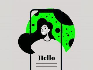
Is it any surprise that web design is suddenly, understandably, loaded up with images of humanity? Avatars, filters, memojis: human identity built to bridge a connection. Images of humans and personalised services bring the website back around to experience.
The experience of your life, of how you look at the world, of how you understand.
It builds connection. Seeing yourself reflected in images, your capabilities echoed in design, helps consumers feel like the brand considers them at all stages, not just to make purchases. It’s conversation and connection without being obvious.
Dark mode or light? Colour or black and white? Larger text, smaller text?
Customisation features allows for audiences to really feel like the brand understands them, understands their needs, understands that sometimes they need text to be bigger or to have a different colour-palette for legibility. Each website a nest of interfaces.
Each interface unique.
Our tip: don’t skimp on accessibility. More people than you know struggle to read tiny text, tell colours apart, or to manoeuvre around a factory-built website. Give your audience as many ways of customising it as is possible, and remember that most of your consumers will be accessing your website through their phones or tablets.
Remember When…?
We’ve been writing a lot about nostalgia recently, and with good reason. From clothing to web design, 2021’s bringing nostalgia back.
In web design for 2021, this means tactile response. It means a physical moment made virtual. Web pages will scroll, turn, twist, move, just like the pages of a magazine, a leaf of postcards, a selection of notebook doodles. Websites look lived in and used and heavy.
Websites are interactive. With so much of our lives conducted virtually, this interactivity, this physicality, helps connect a user to the moment. They’ll remember it.
They’ll want to relive it.
Forget the sleek, flat, 2020 gloss. 2021 is all about the heavy physicality of the past, ‘60s curves, ‘70s patterns and ‘80s colours.
Our tip: What’s your favourite nostalgic memory? Is it the glitchy spatiality of Windows ‘95, or the sweepy, flowery patterns of ‘70s mandalas? Add that into your website – as text, as a graphic, as a hidden link. Nostalgia makes people feel better, think back to a better time. Happier consumers are more likely to remember you when they’re in a position to buy something.
Design With Purpose
There’s been a lot in the news lately about historical moments. We’re living through something that is going to be taught in schools, immortalised in memoirs, and taken apart by university graduates. What history is going to remember is who helped, who hindered, and who watched.
Companies are expected to be the helpers.
Brands are expected to talk about social issues. Audience loyalty, especially now, is a fickle thing to hold: with so many companies talking so much about so many things, it’s easy to switch to a company that better holds your values. We’ve spoken about this before, and we’ll continue to say it – your best supporter is always going to be who you cultivate.
Web design in 2021 puts your loyalties at the centre.
You have to talk about what you support. Sustainability? Community responsibility? Put it in there. Dig through your archives to showcase the diversity of your customers. Add a graphic to talk about burnout. Your audience wants to know that you care.
In 2021, it’s fundamental that you do.
Our tip: you have to have an initiative you’re proud of. Maybe you boosted your employees’ wages when so many other companies slashed them. Maybe you switched to environmentally-friendly packaging. Find your pride, and put it where people can see it.
Softer, Soothing, Supportive
From gentle colours to feel-good news, web design in 2021 wants to uplift.
This means a call back to simplicity. Clean lines. Pastels bleeding into one another. Colours. Whimsical type.
Whereas 2019 was all about the corporate, the glossy, glassy, smooth, professional web, 2021 is about softness and feeling good and design that makes you happy.
Our tip: Play around with colours, shapes, and text. We’ve had our fill of professional blue, corporate grey, and gentle beige. A pop of colour, a curlier text, can help liven up a corporate website – and show your brand’s personality a little better.
Statistics for Web in 2021
We don’t like telling you what to do without backing it up with facts.
Here are a few to get you started.
- 55.64% of internet users come from mobile devices.
- 68% of consumers expect better from businesses when it comes to digital capabilities.
- 94% of people notice the appearance of a website first, and make the decision whether or not to continue using it on that appearance.
- People make up their minds about a website within 50 milliseconds.
- Websites that take longer than 2 seconds to load abandon the website 38% of the time.
- 48% of people decide a business’ credibility based on their website design.
- 85% of users believe a mobile website should be as good or better than the desktop version.
Web Design Going Forwards
We’ve made a lot of changes in the year and a half of the pandemic.
Only some of it is internal.
The rest is external: in the way we run our social media apps, the way we talk to each other online, the way everything looks. From sleek, flat, angular design, we’ve gone for softer curves, brighter colours, and better usability. As more of our lives become entwined with online, this is not likely to change.
If anything, it’s going to become more important. Web is never going to be the same as it was before 2019.
Neither are we.
So hit the ground running, and get ready for the future.


