


eCabs created a market for personal mobility when the options were limited to public transport and traditional ride-hailing services. It is hard to picture the mobility landscape today without the dramatic change that eCabs brought about. After admiring the company from a distance it was a privilege for us to team up with eCabs as their communication partners. After months of hard work, we rolled out the new eCabs brand that we worked on from the ground up.
The brief
There was plenty to do as we took the relationship from strength to strength, and work on the core eCabs identity was on the cards from day one. We were in no rush however – work on the fundamentals of the brand wasn’t the kind of endeavour either of us wanted to rush into.
eCabs is perceived as a cab company with a tech core that’s forward-looking and future proof. But what does tech mean for a passenger?
When the time was right, we locked ourselves up for hours on end, engaging in a stimulating conversation that unpicked the very building blocks of the eCabs brand and systematically put it all back together in a way that codified the vision of their CEO and executive committee and articulated it in a way that everyone who wore the eCabs logo could live by. On the way we worked with their team and their clients to glean a deeper understanding of the perceptions around the brand.


The choices we made
When we’d presented the brand in terms of its purpose, its value system, its customer promise, we worked on the brand’s personality and tone-of-voice. We described a company that works to its own principles, regardless of the external environment, and it takes a principled company to be the exemplary tech/transport company for tomorrow. The final piece of the puzzle was the visual identity.


Implementation
Early on in the creative process we decided to gently evolve the existing identity rather than engage in a complete revolution. After all, the visual identity matches the brand and has significant positive equity on the market.
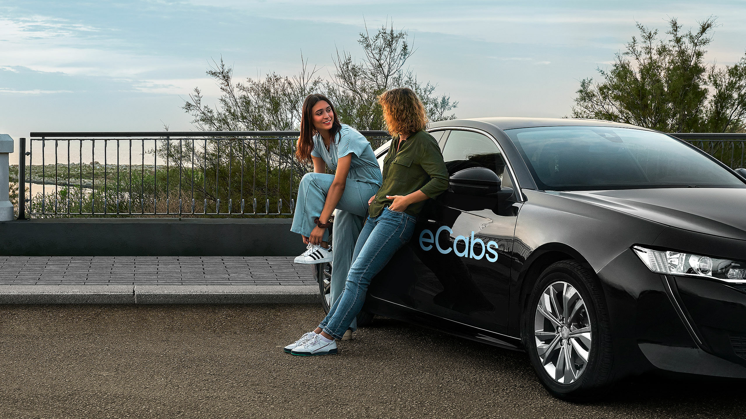
We applied the new visual identity across all touchpoints, from the cabs themselves to the drivers’ uniforms, across the app, site, and all digital platforms, and used the pre-launch phase to cement the way the new personality lives in complex visual storytelling like photography and illustration.


Even as we commenced rollout of the new identity we started to experience the benefits of it. The vehicles, an essential visual touchpoint for a mobility company, are looking great and turning heads. Drivers are thrilled to form part of the newly rejuvenated brand and head out with a stronger sense of pride. Digital touchpoints are seeing more frequent and more meaningful engagement. And we’re working on the finishing touches with the sense of pride one has when the child that’s flown from the nest soars to a success one could have only dreamed of.


Our takeaway
The takeaway for Switch? We do our best work with our clients rather than for our clients. We teamed up with eCabs on this project, sharing a mindspace thanks to frequent and candid dialogue. The result was a project we could all be proud of and that exceeded the expectations we all had going into it.