You know those ads that stick in your head? The ones that make you go, ‘huh’, and then share it with your friends, your coworkers, your family, random people on Facebook?
Cannes 2022 is made up of those ads.
Ad agencies from around the world compete to land a prize at Cannes Lions, hoping to take home one of the bronze, silver, or gold lions. These companies put their heart and soul into their work, and during Cannes Lions, they get to see that effort pay off.
And, hey, even if they don’t land a lion, getting shortlisted is an incredible achievement in its own right.
We’ve been following Cannes for years. This year’s offerings are something special.
Here are nine of our top favourites, whether or not they landed a Lion – in no particular order.
1. Ogilvy Asia – Spotify
Sound Tour (Japan)
Sound creates memories. After two years of pandemic lockdowns and restrictions, Ogilvy Asia wanted to bring back the memory of travelling in Japan – and they wanted to make sure that they used the best platform to do it with. Working with local artisans and Japan-based musician Matt Cab, Ogilvy constructed three larger-than-life Spotify codes that linked travellers in the location to the sound of that region.
Truly, one of the most creative uses of squid at Cannes we’ve seen so far. And you can still listen to the songs on Spotify without having to scan the code. Here’s our personal favourite.
Melissa says, “What a brilliant and creative way to bridge an experience with their app. Not only did they create a playlist per location to enhance people’s experience while visiting, they made it incredibly easy to access it (the codes), by merging it with the culture (the lanterns, the flowers) – it honestly blew my mind how they collaborated with local artisans to create the codes, instead of opting for a printed banner that will look cheap and out of place, they managed to make the Spotify experience part of the landscape in the most subtle, yet visible way. Bloody brilliant. I bow to the team that managed to create both an aesthetically pleasing and functional jurney that enhances a person’s experience – a wonderful example of brand love.“
2. Wunderman-Thompson – Sherwin-Williams
Colours can be deceptive; what you see on a screen or picture in your mind might not actually look the way you want it to in real life, and while it’s not the biggest problem in the world, Sherwin-Williams wanted to make sure that the colour you had in mind is the colour you wound up with.
With Wunderman-Thompson’s help, they brought to life an AI-powered colour system that works with voice search. They ask you, ‘describe your dream colour’, and once you do, the AI trawls the internet’s images to create a custom colour palette. Besides helping people find the best colour for their walls, just the way they pictured it, it’s also helping to build one of the biggest known databases for colour attribution in the world – and lending a lot of insight into which colours are popular where and why.
This one is great for a number of reasons; it’s innovative without being overwrought, and it leverages AI and voice search in a way that’s fun to play around with. Watching the AI generate a colour palette from a single word is effortlessly entertaining, which is one of the highest accolades tech in 2022 can achieve
.
3. DAVID São Paulo – Burger King
We’ve all had at least one experience where something online doesn’t quite render the right way, and the results are one part horrifying to two parts funny. Burger King decided to capitalise on it by seeding glitches and easter eggs into their app, leaving them up to curious fans to come across them – and to incentivise the hunt for easter eggs, people who post their glitches to social media stand to win a discount coupon on top of the up-to-40% off that you get for finding one of those glitches regardless.
Our Head of Studio, Andrea, is especially fond of this one: “Most of us have come across these weirdly hilarious glitches in games, or have seen videos of these, so we can easily make the connection with that one hilarious moment when things didn’t go as planned. But those imperfect moments are the ones we remember and stick with us the most.”

4. Gong – Netflix
Gong is a Polish agency. ‘Lady with an Ermine’, a Leonardo Da Vinci work, is the most expensive painting in Poland.
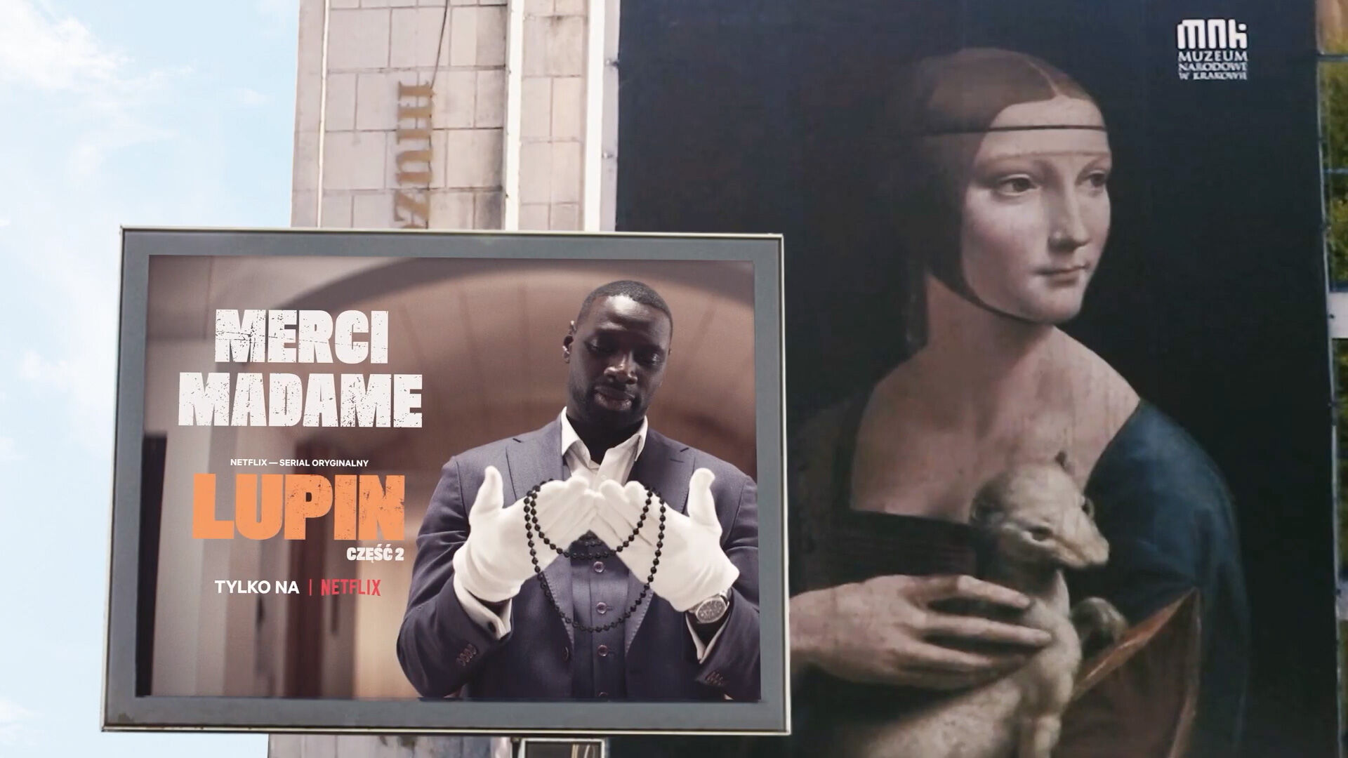
To promote Netflix’s Lupin, a series where gentleman thief Assane Diop carries out elaborate heists in the style of Arsène Lupin, they worked with the Polish National Museum to use the most famous painting in Poland as guerilla marketing. They set up a painting both inside and outside of the museum of the Lady with an Ermine missing her trademark black necklace, generating quite a lot of buzz from people who happened to see the painting.
A few days later, Gong added one more thing to the campaign: a shot lifted from Lupin, where Assane Diop holds a black necklace and says, ‘merci madame’.
A good public billboard can do a lot, and it’s easy to overlook the impact of a billboard when we have so much more technology at our disposal – however, Gong pulled off an incredible piece of guerilla marketing using one of the oldest forms of advertising, and invigorated a field where it’s easy to get lost in the noise of other adverts: incredible, stunning work, no matter which way you look at it.
5. BBDO Canada – Canadian Paralympic Committee
Lego is one of the biggest toys in the world, beloved by adults and kids alike. Their expansion packs feature everything from astronauts to figures taken right from popular culture, with more coming along the way – and thanks to BBDO Canada and the Canadian Paralympic Committee, we now have a taste of what it looks like to have Paralympic minifigures to add to Lego’s considerable back catalogue.
Product design that’s a force for good is always worth attention. The paralympic minifigure pack showcases a subset of society that has been overlooked in toys; it’s true that not every kid or adult needs to see themselves in product offerings, but seeing yourself reflected in society always helps.
As Andrea said, “Lego needs to make this yesterday.”

6. Grey New York – Applebee’s
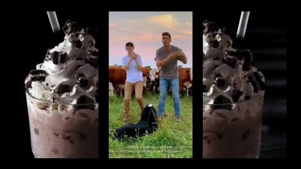
Tiktok virality – any virality, actually – is hard to chase after. Most ads never reach that level of international acclaim, and that doesn’t mean that they’re bad ads; it just means that it wasn’t their turn. This ad by Applebee’s never had a chance not to go viral. Combining Tiktok dances, feel-good bouncy Southern music, and everyone’s favourite topic (food), it’s the kind of thing that gets pretty good when it’s done accidentally.
Underneath the helm of Grey New York, it’s hilarious and light and an antidote to the really heavy couple of months that we’ve been through.
Also, the song’s really catchy.
7. Dentsu Creative Bengaluru – VICE
We live in an entirely different world now than we did, and that occasionally means reckoning with a past that is less than beautiful. For VICE, Dentsu Creative Bengaluru wanted to make a point about colonisation.
But instead of an outright attack, Dentsu Creative went one step further, and created an educational experience that nobody can argue against. The Unfiltered History Tour was created to elevate under-reported issues and to reach out to a younger audience so we can start changing our future, even if we can’t change our past.
The British Museum is full of artefacts taken from countries around the world, some of which have been fighting to reclaim their treasures for years. They’re not saying anything new – this history has been raked over the coals of social media for years – but by bringing it to national attention, there’s a hope it can prompt change.
Our copywriter likes this one in particular: “History is a thorny subject for countries in power: it’s hard to sell a national glory when your past is full of things you’d rather not reckon with, but it is a history that needs to be known. Bringing it to awareness is the only way to affect a lasting change and make sure that you end up on the right side of history – the one that understands that you had a hand in shaping the current world, and that you’re trying to make amends for it.”
8. VMLY&R Commerce – Elena’s
The pandemic pushed a lot of stores into closing their doors and taking their businesses online, and for some, they were struggling to stand out in a market that had had decades to build a reasonable presence in real life. It happened to Elena’s, a Mexican ice-cream store that needed to come up with a way to stand out on the grocery store shelves immediately.
To do so, they released a special edition ice-cream: The Fan Heartbreak Ice-cream, a five-tiered tub where each flavour has mood-lifting properties to get you through a hard time. They also restructured the entire website to guide you through the flavours themselves, and give you tips on how to boost your mood.
Shortly after, they released limited edition packaging to poke fun at Mexico losing the Gold Cup finale, which further boosted the narrative of ice-cream as intrinsically tied to making you feel better.
It’s a clean, beautifully shot campaign that turns a traditional story on its head, and really makes you think about why ice-cream has such a connection to heartbreak – and best of all, it made people laugh at a time when people really struggled to find something to laugh about. A great campaign all around.

9. Performance Art – Black&Abroad
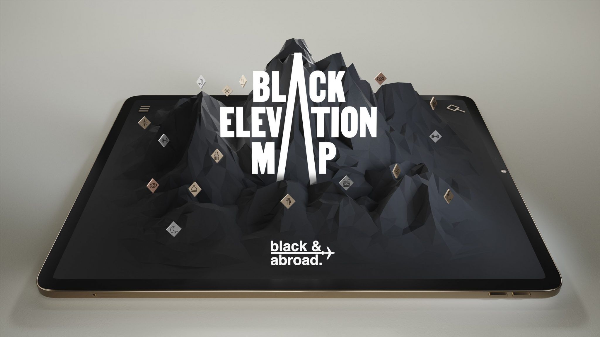
Data has blindspots: things that you miss out on if you’re not looking, and it isn’t a big stretch to understand that the data that most normally has those blindspots come from minority groups. Black travellers who want to trace out the impact Black Americans have had on the culture of the United States have few resources, and Black&Abroad wanted to change that and give travellers something to help. The Black Elevation Map charters a route through America where the influence of Black creators is taken into consideration: from restaurants that fuelled the Civil Rights movements to the accolades won by startup tech companies, the Black Elevation Map is designed to be easy to read, easy to parse, and easy to use.
It’s an excellent use of data for something that can truly bring forward a better understanding of the Black American experience.
10. Bonus! ReThink’s Multiple Entries
Fellow ICOM partner Rethink has had multiple entries win awards at Cannes, and they’ve been voted the third best independent agency network overall – so we can’t end this list without leaving at least one mention of Rethink’s work. From their ‘draw ketchup’ campaign for Heinz to the ‘Colours of Pride’ in support of gay rights, Rethink has had a banner year for awards, and they’re well deserved.


