


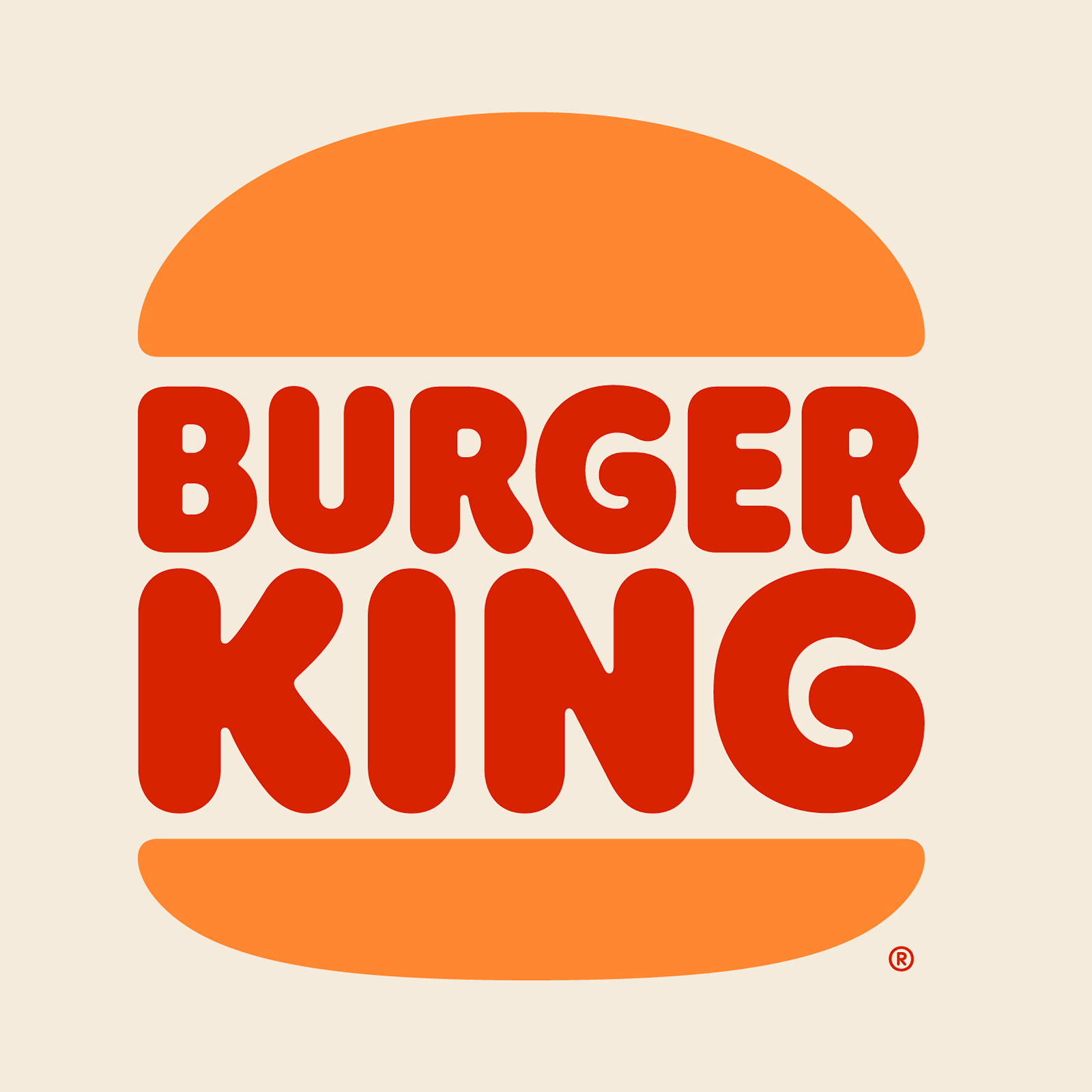
Burger King kicked off 2021 in true King fashion: dropping a rebrand of their 20-year-old visuals overnight.
In less time that it takes to get your Wolt delivery, the Burger King identity that a lot of people grew up with went from this:
To this:
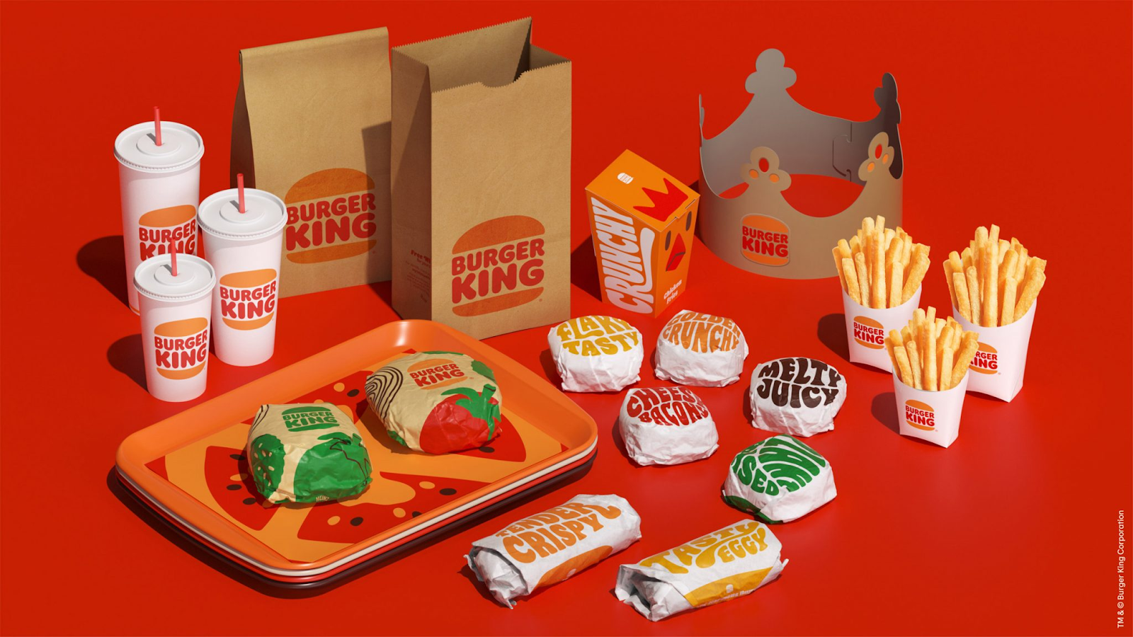
Smoother. Flatter. Less of that primary colour ‘tell us how you grew up in the 90s without saying you grew up in the 90s’ glow. Overall, a ? from us and our design team. This also, naturally, included their packaging:
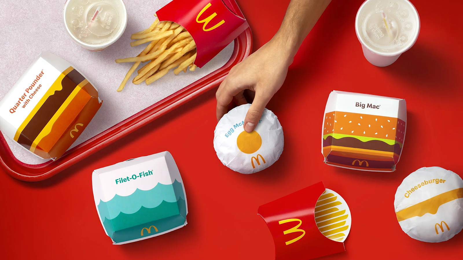
A month after Burger King rolled out their redesign, McDonald’s announced their new packaging rebrand:
And, well, we have some thoughts.
To rebrand or not to rebrand?
You own a brand.
It’s a well-known brand. Customers know your logo. Your slogan has become part of public memory. Your colours are easily recognisable.
Maybe you’re a massive corporation, like McDonald’s, where billboards globally glow red and yellow. Or maybe you’re smaller – an innocent, clean lines and white packaging, easy to pick out on supermarket shelves – or localised – eCabs, unfamiliar anywhere but in the streets of Malta. Regardless of what size of corporation your brand is, you have a logo and a colour story and a visual identity that, over time, becomes embedded into public awareness almost more than anything else you can do.
A brand is a combination of everything that it stands for – its behaviour – and the way it expresses itself. So why rebrand? Why would a brand change its stripes?
The list of reasons is endless but usually it is one of, or a combination of, the following:
- Reputational issues. The brand made some serious mistakes and is now repositioning itself, along with a total overhaul of its visual identity
- A fundamental change. The brand stood for something and now stands for something else so it is addressing its visual identity to suit its new character and beliefs
- It looked great a while ago. Like scented gel pens, low-rise jeans, and the candle salad, some things just go out of style and won’t come back until Apple makes them out of chrome. Time to get with the times and look like the brand belongs in this decade.
- The times have changed. What made you unique at the start is now vaguely racist/misogynistic/bigoted/anachronistic/too-far-right or too-far-left/etc. When the last dinosaur in the boardroom bows out, the team rejoices and rebrands.
- The marketing team needs to justify its presence. This is not a good reason to rebrand. PepsiCo, Google, we’re looking at you.
Rebrands aren’t a bad thing.
Rebrands are (often) necessary.
Like everything else in human history, sometimes we look back on something we’ve done already and think, ‘maybe let’s not do that again’. With corporations, the same rule applies. The only difference is making sure that you remain relevant enough to your old identity to keep your audience.
The Case For Burger King
Burger King’s rebrand actually went back in time and revisited a logo they’d used primarily throughout the 1960s-1990s, before their 1999 blue, red, and yellow logo became their primary identifier. In 2015, Burger King packaging scaled down again to recall brown-bag lunches, and phased out the Mr. Clean white and primary colours for more down-to-earth and natural colours.
Now, in 2021, their latest rebrand seems to be combining the best of both worlds: retro 70s whimsy and their late 2000s naturalism,creating a hybrid identity that manages to both stand out and blend in. See it on the side of a billboard or delivered in a flyer, and Burger King looks good, slick and nostalgic the way Netflix makes nostalgic (i.e. in high definition and with the gloss of the modern).
It also looks appetising. This is important for a chain that primarily sells junk food.
Out of the three colours Burger King’s identity originally had – red, yellow, and blue – only two made the cut. The introduction of a bright green helps to tie back to one of Burger King’s new, primary values: better food using fresh ingredients. Flame-grilled, maybe not good for you, but tasty and better than the fried alternative.
Our conclusion: it’s pretty. It’s modern. It makes you hungry. It still looks like Burger King. 10/10 for the King.
McDonald’s
McDonald’s didn’t touch their logo or their overall uniforms. What they did change was their packaging.
Their last packaging update, in 2016, went hard on the bright white and day-glo colours. Boxer, their then design agency, kept the more traditional red and gold McDonald’s built their identity on, but worked in bolder colour choices: dark purple, sea-foam green, bright orange. The overall aesthetic flattened. The text grew bigger.
Cue 2021.
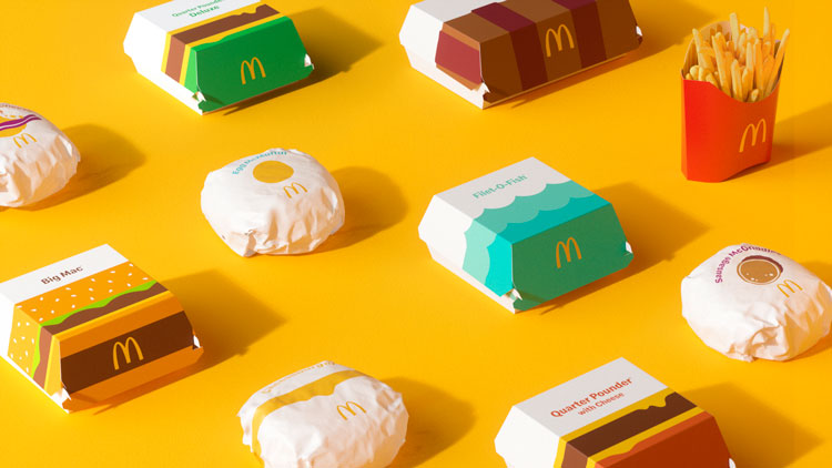
In with the simple, flat shapes, out with the random colours. The McDonald’s redesign isn’t as in-your-face as the Burger King redesign, but it does showcase the products in a way that makes it impossible to mistake one thing for another; more importantly, they look good enough to eat. It’s fun. It’s bright and childlike and colourful, even if it isn’t necessarily something that will stir the appetite.
The problem with the McDonald’s redesign is this: there’s nothing to distinguish it as a McDonald’s product.
Omit the text and the Golden Arches, and it could be any burger place, especially considering that the flat illustration trend has been slowly absorbing industries since 2006. While the same can be said for Burger King, their redesign tied in elements they’d previously used.
Crucially, the rebrand fails a swap test. Swap out the McD logo for any other logo and there would be nothing to let an audience know that the packaging is McDonald’s packaging. This is a fundamental flaw in identity and packaging design.
The main difference between the redesigns is this:
Burger King’s redesign keeps to their brand values.
McDonald’s redesign seems to thwart theirs.
Opinions
We asked our design team what they thought.
Our Head of Design, Andrea: “Burger King’s redesign is interesting because it actually acknowledges that you are not the mass-market brand that McDonald’s is, but the counterpoint is that they can actually have more ‘fun’ with their brand. The organic type gives me the impression that their food is ‘closer to being handmade’ than any other fast food restaurant that goes for, or went for, the standard Helvetica. The groovy and happy-go-luckyness of the brand refresh is obvious, and all the type also gives the feeling that the letters are melting, maybe because the food is nice and hot?
Meanwhile, McDonald’s has succeeded in telling a very succinct story through their packaging. Having over 30k+ stores in multiple countries, language barriers generally require different packaging designs, and McDonald’s have managed to really depict the contents of the product through simple graphic elements, with no real need for text. I’m not sure if it was intentional, but showing a ‘box full of chips’ only when I’ve eaten all the chips makes me want to go get another serving.”
Conclusion
There’s a growing trend among company redesigns: no matter the brand values, the brand will ‘modernise’ its image. Usually, this means they turn to flat illustration. While it works for a handful of brands, and certainly it’s a beautiful style to use, having every brand turn to flat illustration creates the problem that brands become hard to distinguish from each other.
With big corporations, a loss of identity isn’t a big risk.
With smaller entities, it is.