So you’ve decided to take a look into inbound marketing for your company. That’s great – if you’re a regular reader of our blog, you’re well aware that we’re all for the greatness that is inbound marketing.
In one of our recent posts, we spoke about 5 brands who really get content marketing and the concept of talking ‘around’ your brand instead of ‘about’ it. This would need to happen both offline, on your website and, very importantly, on your social media pages.
Most of the larger digital marketing blogs would tell you to pick your network carefully depending on the nature of your business – if you’re a B2B, go for LinkedIn. If you have a product catalogue, use more visual networks like Pinterest. Here in Malta however, you simply cannot ignore Facebook.
Yes, I know. Facebook isn’t exactly your top priority in your business strategy, being a vortex of procrastination and all that, but that doesn’t mean that you shouldn’t spend at least some time making your Facebook page work for you and stand out among the rest.
There are many theories to explain why people visit brands’ social pages – offers and promotions, competitions, customer care or just to keep updated with quality content – but whatever the nature of the page, it’s an undeniable fact that people will always drift towards the pages with beautiful design and breathtaking imagery.
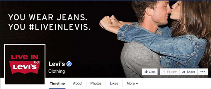
I’ll give you one guess as to what it is people look at first when landing on your page – it’s your cover photo. It’s the most noticeable thing about your page, and that’s exactly why you want to make sure that you’re following the best practices for creating and optimizing your Facebook cover photo.  It’s not all about finding a pretty picture – whether you’re using Facebook to generate leads, close your next sale or create customer community, your cover photo is a crucial part of making that happen.
Plus – Keep in mind that your cover photo doesn’t just live on your Page. Whenever someone likes your page, your cover photo will pop up on the walls of every Facebook user who follows that new fan of yours, like this post to the right..
To help make sure that your cover photo is the best it could be, check out these 10 best practices below:
1. Check the Facebook Guidelines
Let the eye-rolling commence. Yes, this is absolutely the first thing you need to check about when creating not just your cover photo, but every item of content on your page. Before you ask – no, Facebook doesn’t actually say what will happen if you violate the Facebook guidelines, but it’s probably not a good idea to risk having your page taken down over your cover photo, right?
2. Make sure it’s the right size
851 pixels wide by 315 pixels tall. You’ll want to get that right from the start when designing a photo, because why would you want to spend time getting a new image designed only to have it look funny once you upload it? You can view our full template for Facebook image sizes right here. (We’ve included a full image size guide in this post – scroll down to see it now.)
3. Keep mobile in mind
The Facebook mobile app doesn’t re-size your cover photo to fit everything in. Rather, it only displays the middle-to-right portion of your cover photo. If you’re targeting mobile users on Facebook, you might want to keep this in mind when including text or certain images in your desktop cover photo.
Keep the important information center- or right-aligned, or you could have large parts of it cut out to look something like this:
4. Lay out your content carefully
Be aware that your profile picture covers a section of your cover photo in the bottom left corner when the user lands on your page.
The part of the cover image that lies behind the profile picture won’t be visible until the user clicks on it, so be sure to keep that area clear of any text or information.
5. Keep it visual
This time last year, Facebook had finally done away with the 20% rule on text in cover photos. This means that you have more freedom when designing the layout for your cover photo, but you should still be careful when including text in your designs.
Keep your copy concise and focus on the visual element of the design. That’s what the cover photo was designed for and will make your page much more engaging, even at first glance.

6. If you’re using text, make it count
When Facebook revoked the 20% text rule, they also allowed people to use calls-to-action in their cover photos. CTAs, key text and striking visuals – if you want your cover photo to help you convert, that’s all you need.

7. Speaking of text… got a hashtag?
If you’re promoting an event or product through your cover photo, be sure to include the relevant hashtag, where applicable. You can include it in the design of the actual image for recall purposes, but more importantly, remember to include it in the description to make your photo more discoverable.

8. Don’t forget the description
The calls to action on your cover photo won’t be clickable buttons, but that doesn’t mean that you can’t still direct people to your landing page. Be sure to include clickable links in your cover photo description so that anyone clicking on your cover photo will be able to take the next natural step to wherever it is you want to take them!

9. Change your cover photo regularly
Make your cover photo work for you by changing it whenever you have something new to talk about. Highlight current campaigns, seasonal trends or special events by creating cover photos about them to build awareness or drive more traffic via the link in the description.
10. Own your content
You know by now that Facebook have removed most of the restrictions for page cover photos. In fact, they’ve dropped them all, except for one:
All cover photos are public, which means anyone visiting your Page will be able to see it. Cover photos must follow the Pages Terms and can’t be deceptive, misleading or infringe on anyone else’s copyright.
Simply put: be truthful, own your content and don’t make people change their cover photos to match yours. Fair enough, right?
One last thing – keep other, non-Facebook regulations in mind when promoting something on your cover photo, especially if gifts and prizes are involved. The Maltese Lotteries and Gaming Authority (LGA) has specific regulations for any form of lottery or luck-of-the-draw competitions – even those held on Facebook or other networks – so keep that in mind before you start pumping your precious marketing budget into your next competition.
As promised earlier, here’s a handy guide to all image sizes you’ll need to consider when running a Facebook page. We’ll be sharing one of these for all the major social networks over the coming weeks, so keep an eye out!


