
Our brand carried us through more than a decade of growth. It shaped how we showed up through reinventions, refinements, and the evolution of our work. By 2025, we recognised it was time to elevate it. We’d grown. Our ambition had grown and this raised our own standards with it. So, we did what we always do – we questioned all we do from the ground up, starting with our very foundations.
Just as we do with our clients, we started with a structured diagnostic: the 20-point analysis. While we’ve never formally scored ourselves, the framework is ingrained in how we think. We knew where the gaps were, and the model brought both our strengths and areas for improvement into focus. In particular, it highlighted:

Where our purpose, mission, and promise needed reframing

Where our visual identity was lagging behind the ambition we had for ourselves

And where our internal alignment, while strong, could benefit from clearer articulation
That’s what the 20-point analysis is designed to do: shine a light on strengths and weaknesses in the business so you can take deliberate and strategic actions, proactively.
The updates weren’t sweeping, but they were significant, tightening what was already strong and aligning it with where we’re heading. Most importantly, we shaped them to hold ourselves to the same standards we set for our clients.
Because the team was already aligned in direction and spirit, the refinements felt less like reinvention and more like re-articulation. A clearer way of expressing who we already were.
The core of what we stand for hasn’t changed. But we’ve learned more about ourselves as we grew, and we made sure this is respected in the way we articulate our values and the promise we make to our clients. The relevance was further amplified as we shifted our target audience to suit the areas in which we specialised along the way.
The work we did on our underpinnings will also be reflected in the way we express ourselves. Our visual identity and tone of voice have also received the care they deserved.


Shedding almost all of our visual legacy was a deliberate choice, which was also a strategic choice for the team, where we would see ourselves deliberately ‘wear the new clothes’ that align with our purpose and promise. Our goal was singular: design a visual identity that champions the idea of building better business through Clarity.
The design process was a merging of minds and hands. We bounced ideas off each other, explored different interpretations of the brief, and collectively paved the path forward. We passed on sketches back and forth for constant refinement, often leaving behind ideas and concepts we loved in service of what worked. Every choice was made with brutal honesty. When things clicked, we collectively knew it, and it did not happen by accident. The intangible “this feels right” was a result of truly internalising and experiencing the full extent of Switch’s purpose and promise.
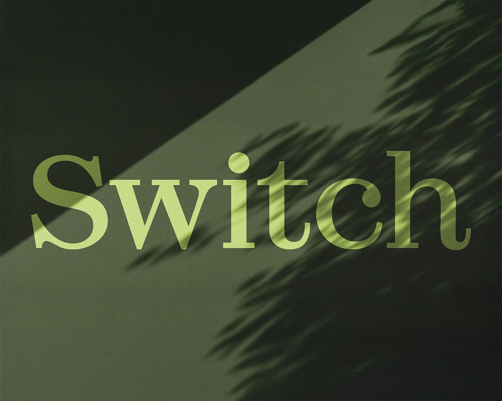
Everything in the new Switch Visual Identity stems from the new wordmark, a typographic representation of who Switch is. Built from letterforms that balance strategy and structure, that represent the calculated work we do, with humanistic curves and flairs, that celebrate the natural human essence of the Switch team.


A nod to our legacy came through the use of the core green hue, albeit muted, and paired with an approachable purple tint. Graphic elements were extracted from the new wordmark and were then formalised to serve as building blocks to build every piece of design collateral. Be it for static layouts or motion graphics, every visual narrative we created was anchored to the idea of delivering clarity. The same core solid shapes take a complete life of their own through the illustration suite we developed, cementing the brand kits’ flexibility of use.
We built in opportunities to design across a spectrum of intended outcomes, where changing the use and scale of the same core elements tweaks the tone of the creative collateral. This left us with a brand kit that is defined to the point that every piece feels unmistakably Switch, but invites creativity and experimentation – allowing the brand to be alive.
This new identity feels like a true representation of who Switch is today, and where we are going tomorrow. It reflects the maturity of our ideas, the clarity of our purpose, and the confidence of our presence.


When you are your own client, it’s too easy to deprioritise your own needs. But we knew that deferring the work would eventually cost us more in alignment, messaging, and opportunities.
So we made the time, and we were strict about protecting it. We treated ourselves like we treat our clients: with care, discipline, and respect.
The most common reason not to start a process like this is timing. “We are too busy.” “It’s not the right moment.” “We’ll do it next quarter.”