To encourage any individual to be a better version of themselves through sports.
Sports events in Malta have been growing consistently over the past decade. However, the market remains fragmented and the options available to athletes vary hugely in terms of quality and consistency.
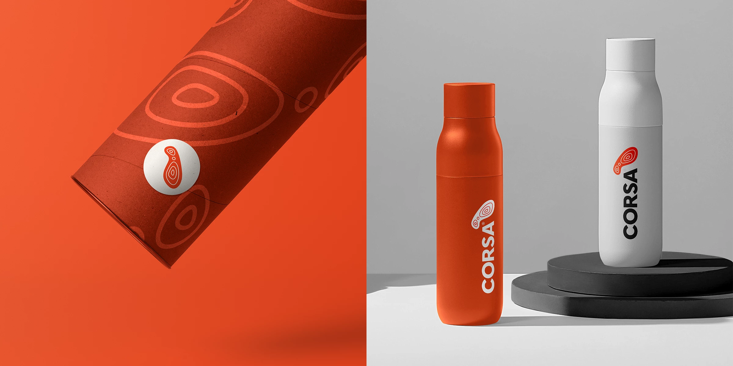
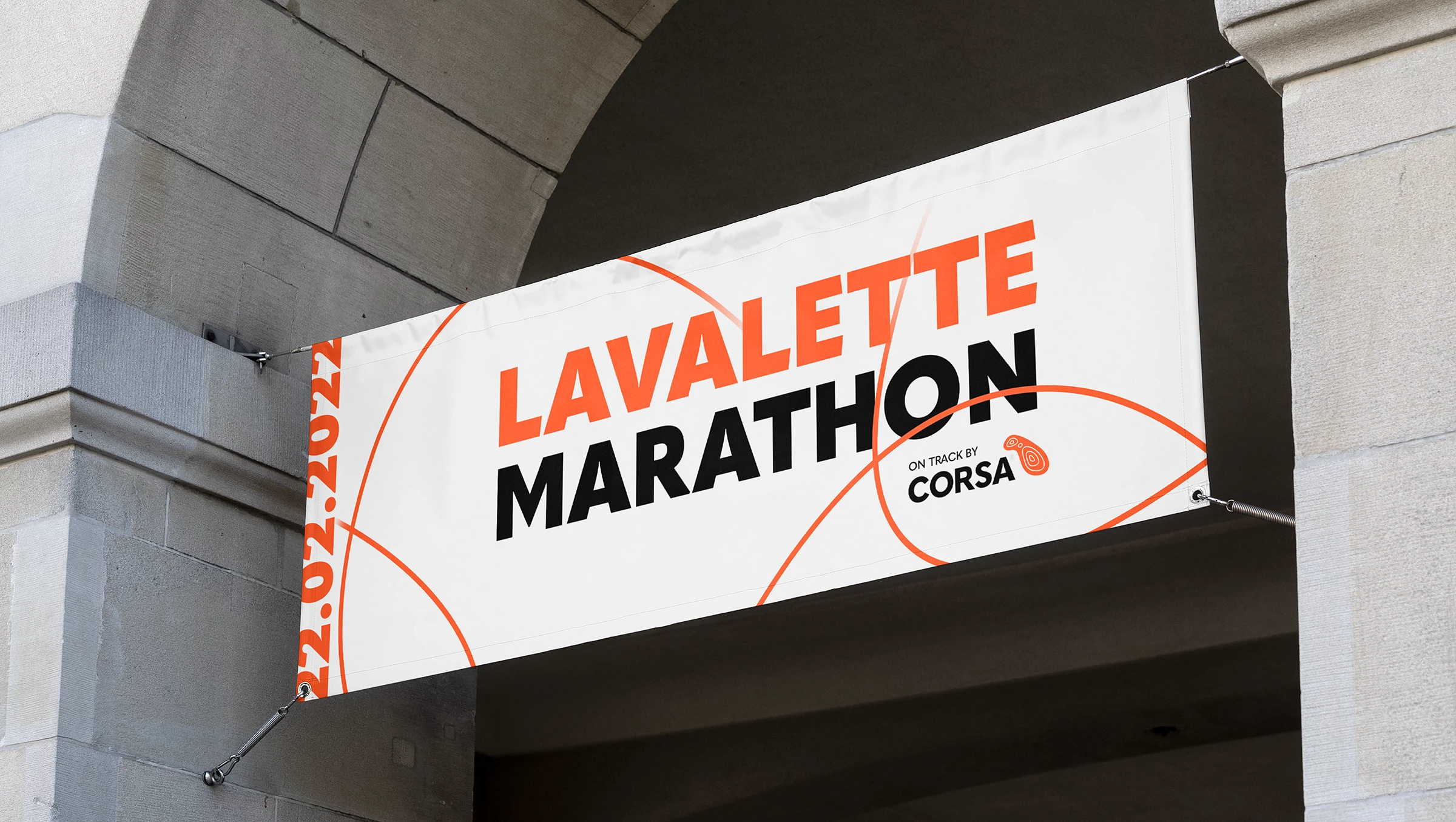
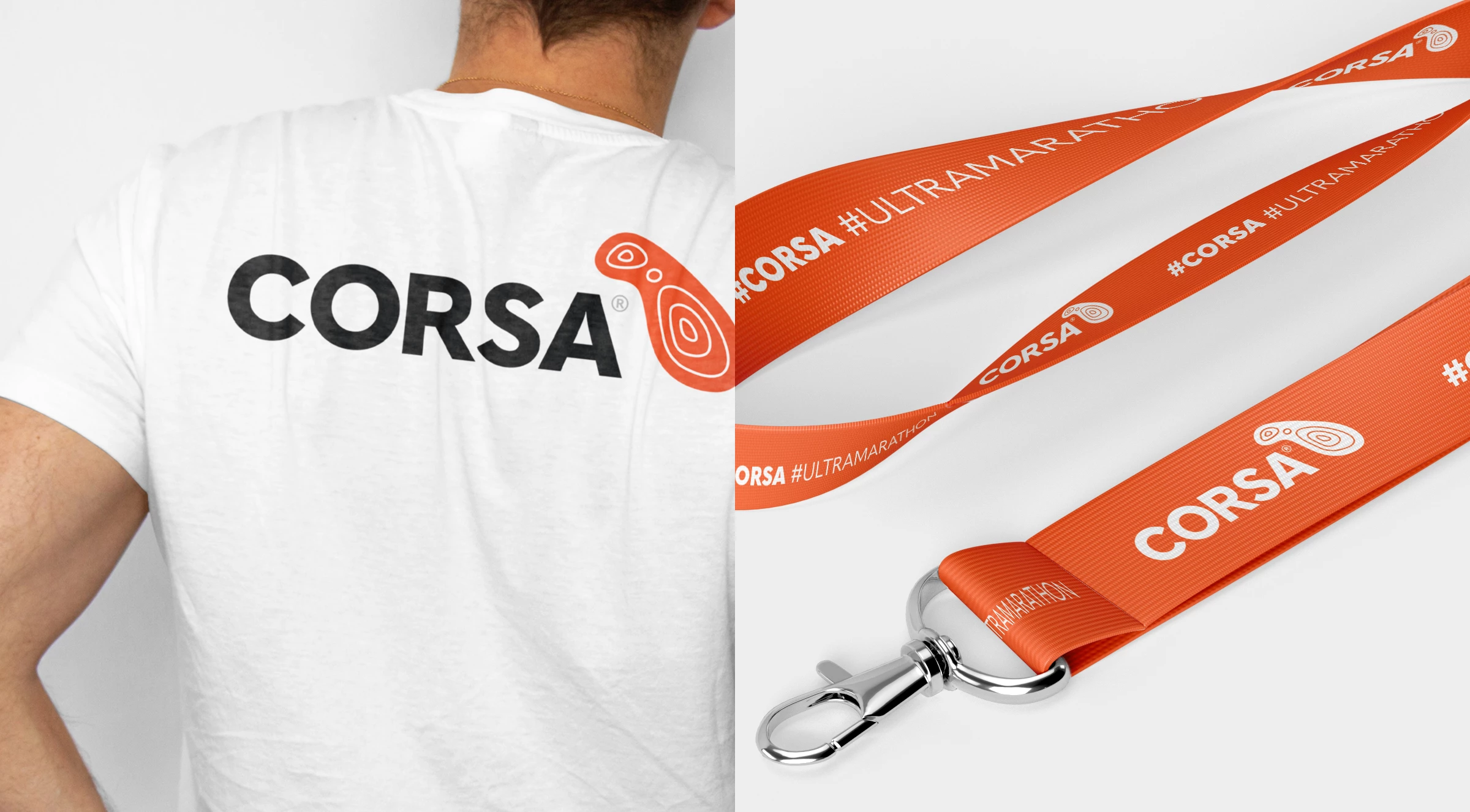
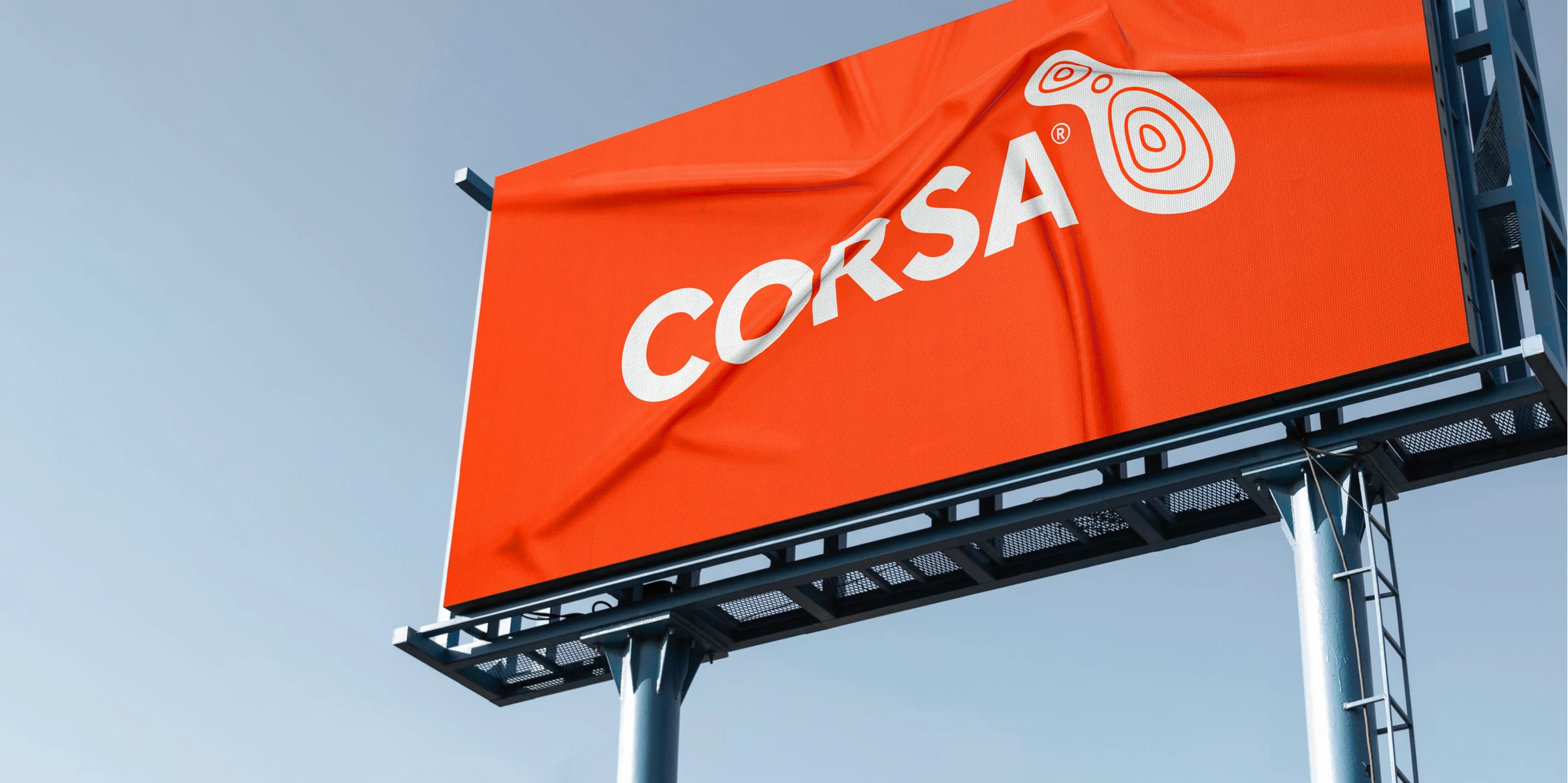
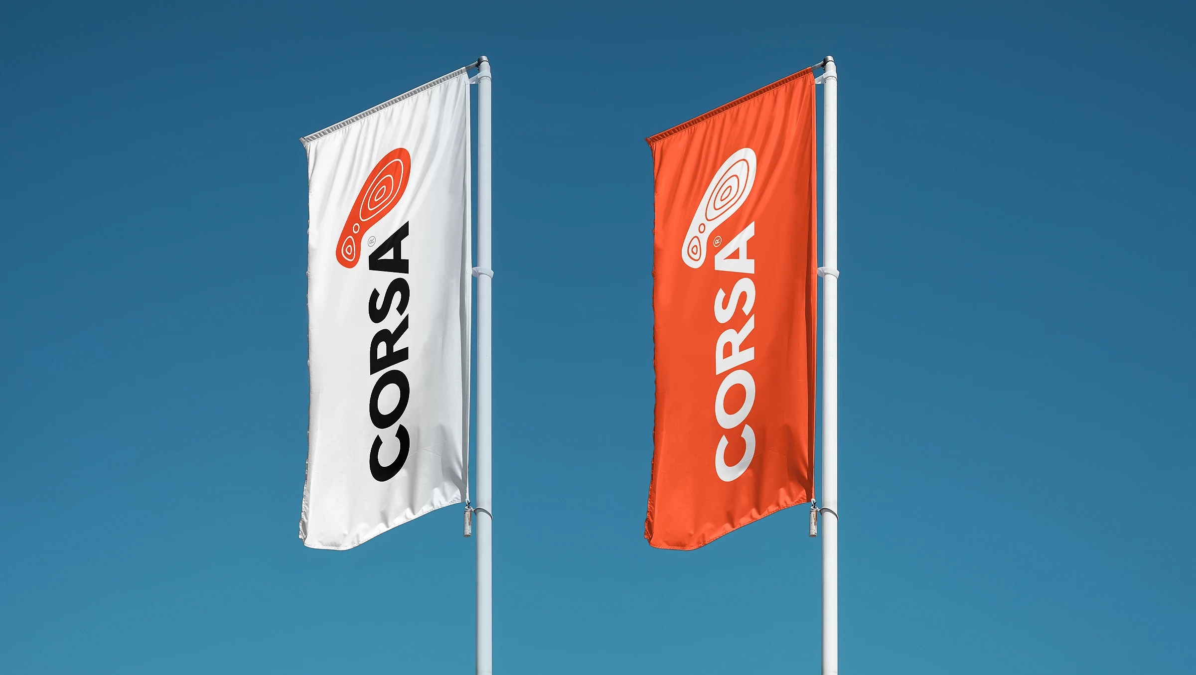
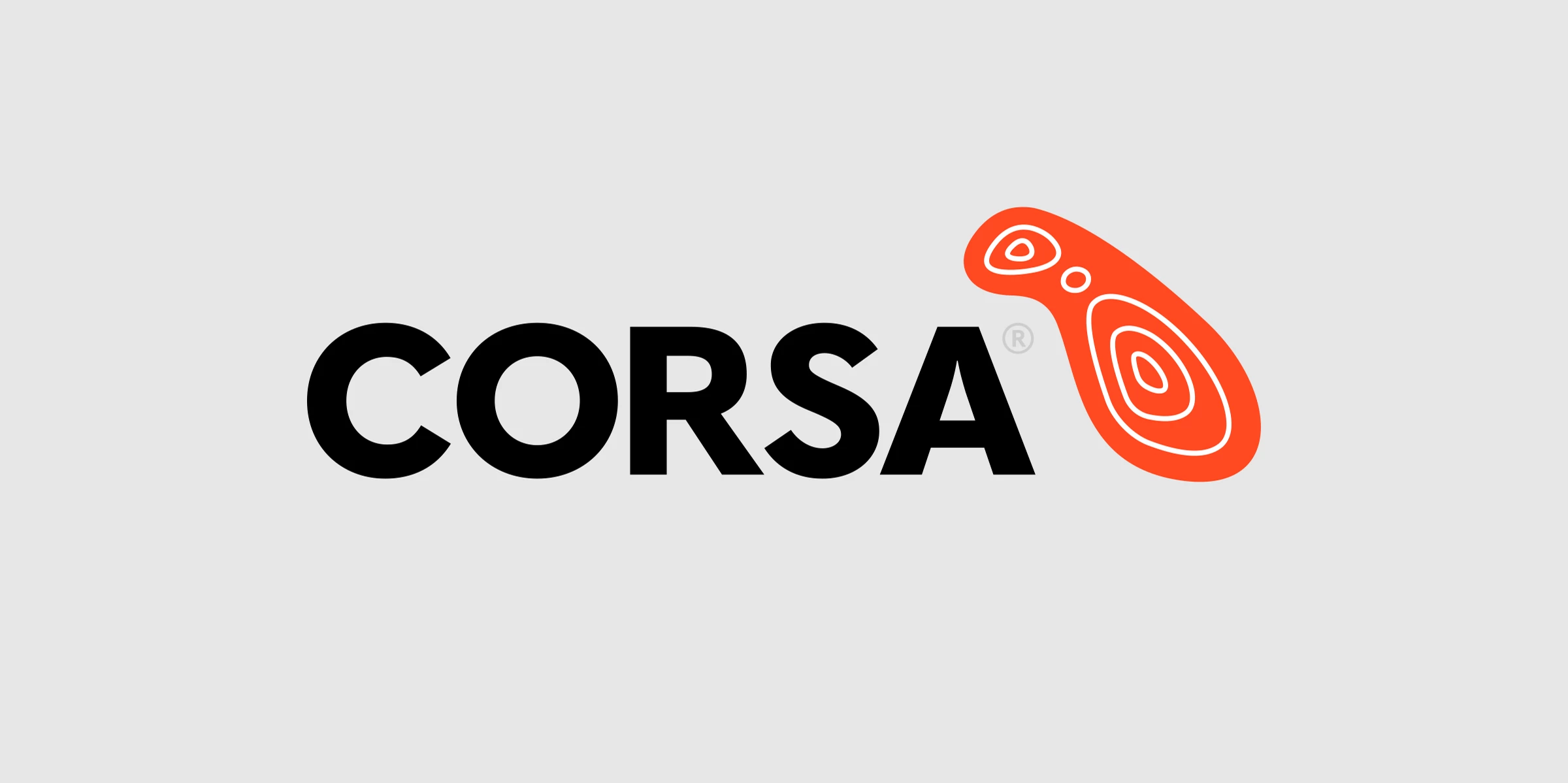
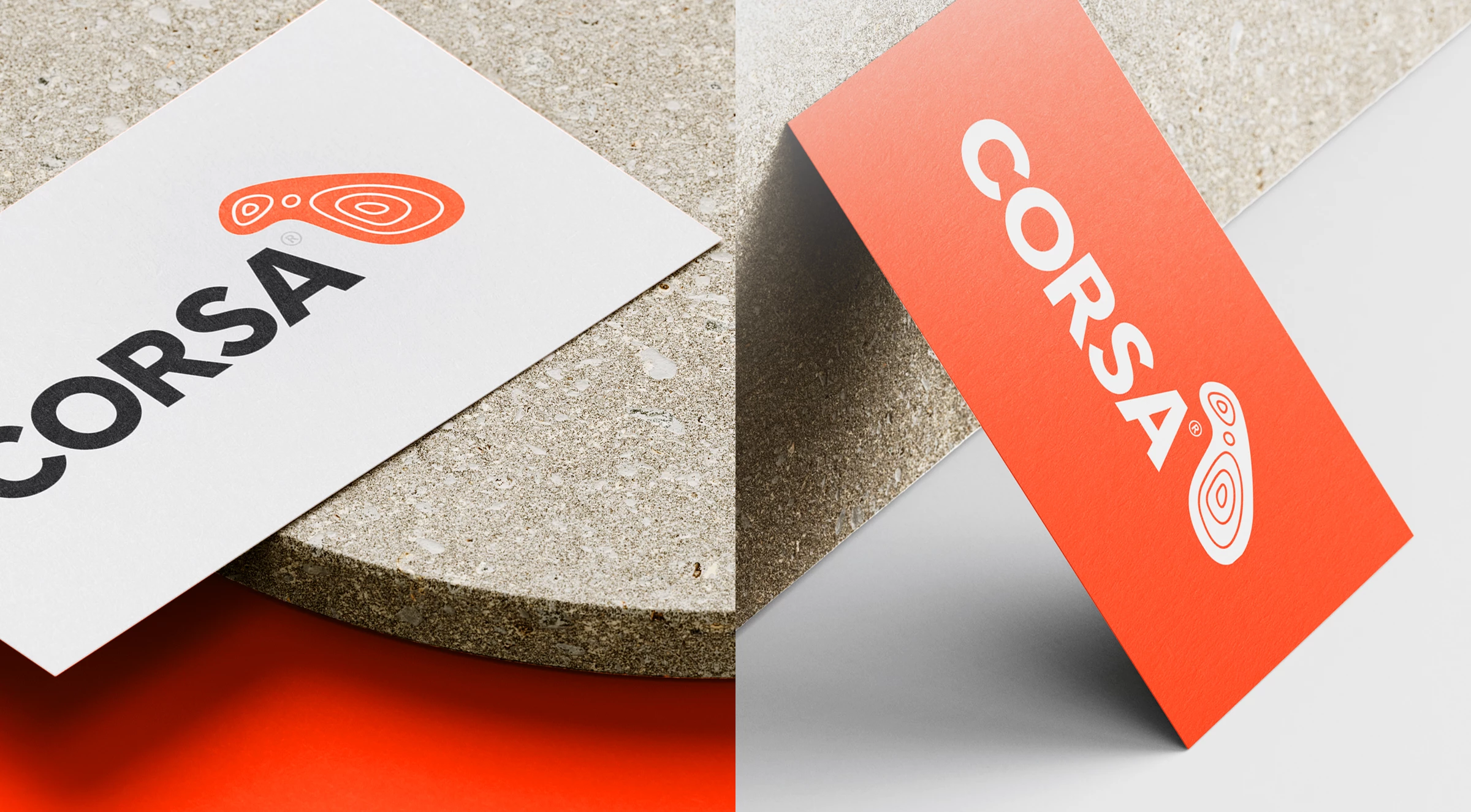
The Corsa identifier was inspired by the merging of a footprint and a graphic interpretation of Malta. This mark marries Corsa’s two primary visual cues; Physical Activity and the Maltese Islands.
The topological visual hints both at the pressure one makes when running, and also indicates that the events happen on all forms of terrain around the islands.
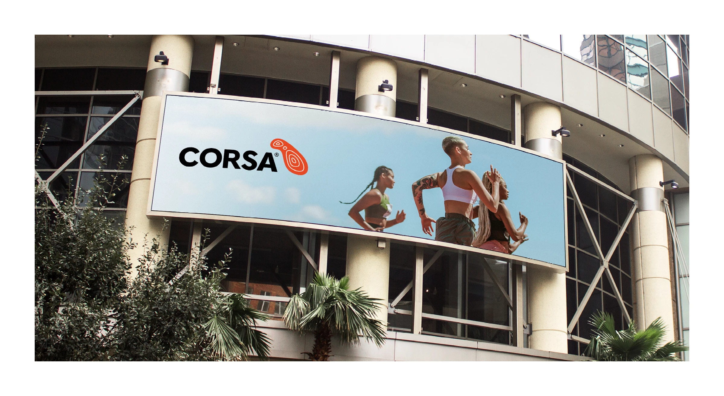
Alongside the identifier, the Corsa name is visualised using a strong, bold modern sans serif face, pitching Corsa at the same level as other top-tier sport event brands. The no-nonsense typography is clear and legible at extreme sizes.

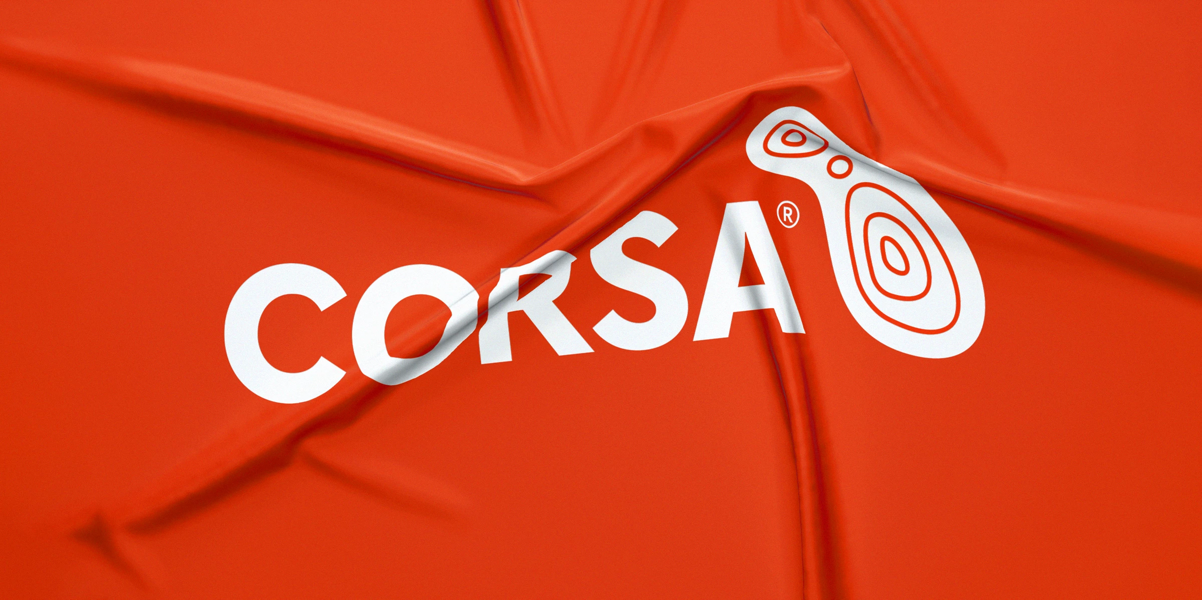
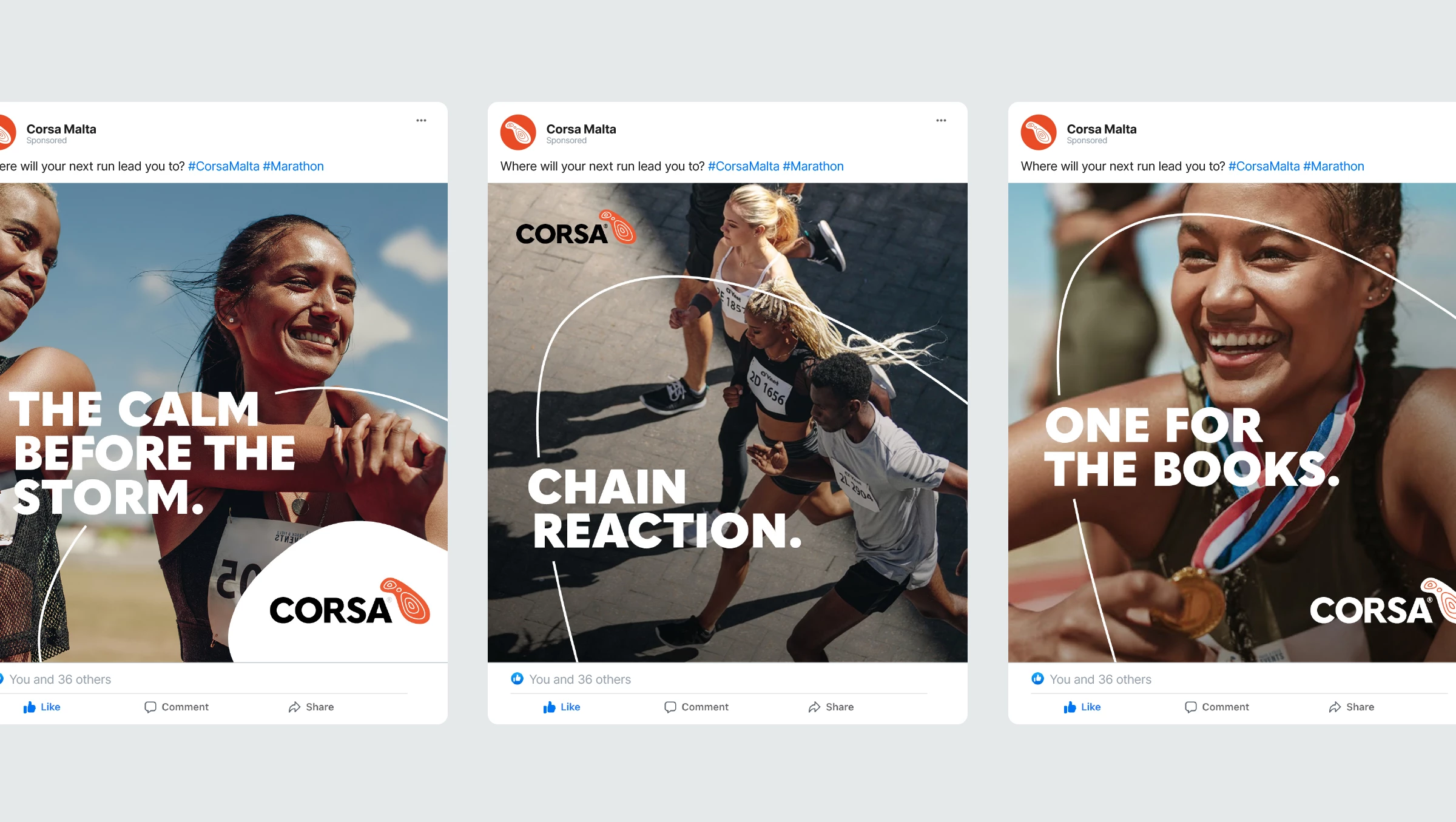
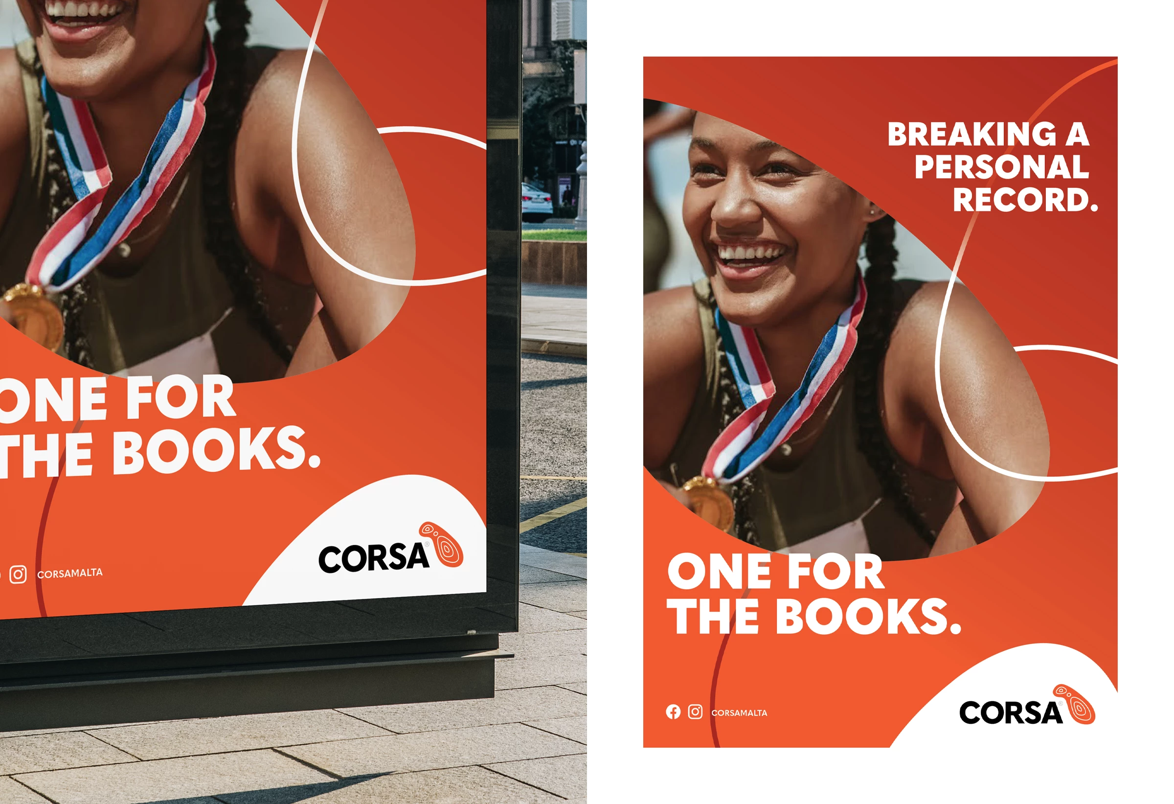
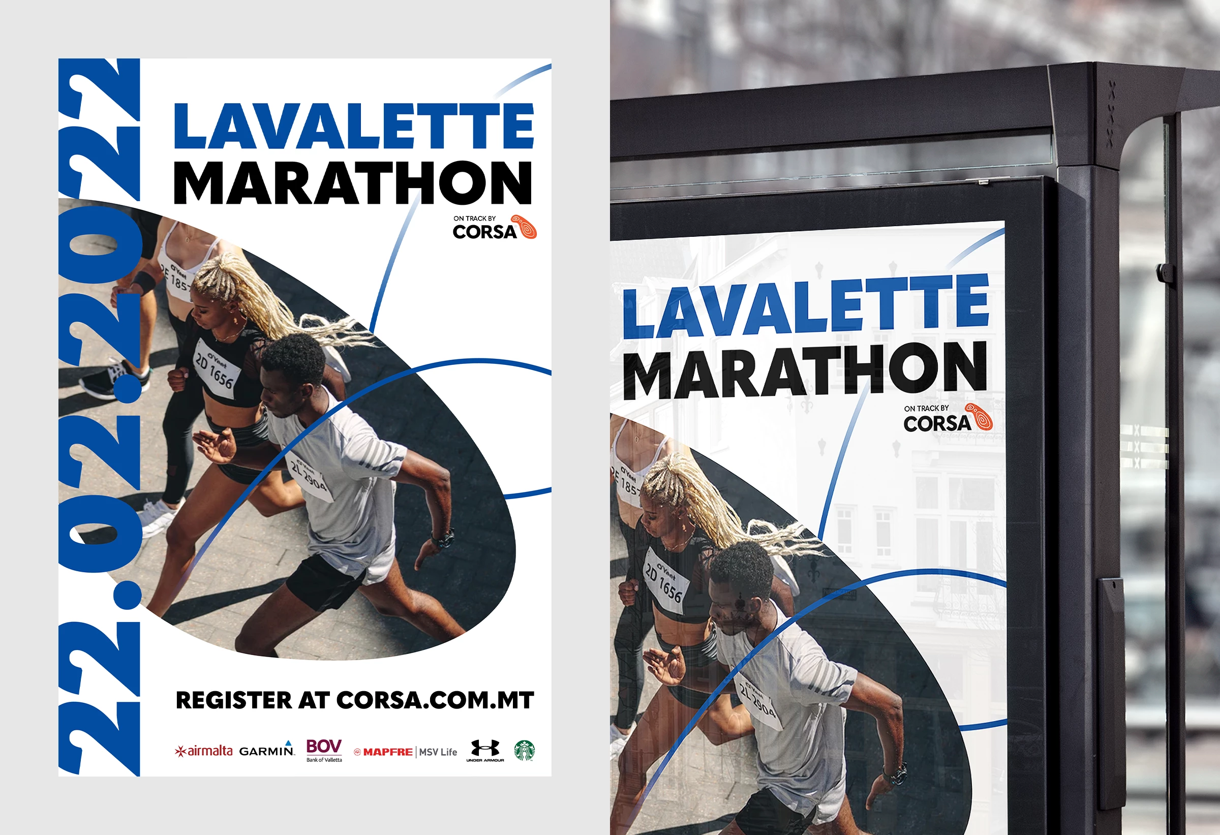
Corsa is alway moving. The topographic elements from the identity come to life in all communication.
Corsa relies heavily on beautiful and inspiring photography, supported by a short motivating written message. Visuals take a lifestyle approach. Corsa is not a physical product but an event that brings with it multiple emotions. The heroes seen in the imagery are fit but never look like their physique is unattainable. They wear technical clothing that most of us own; the images inspire but never alienate.
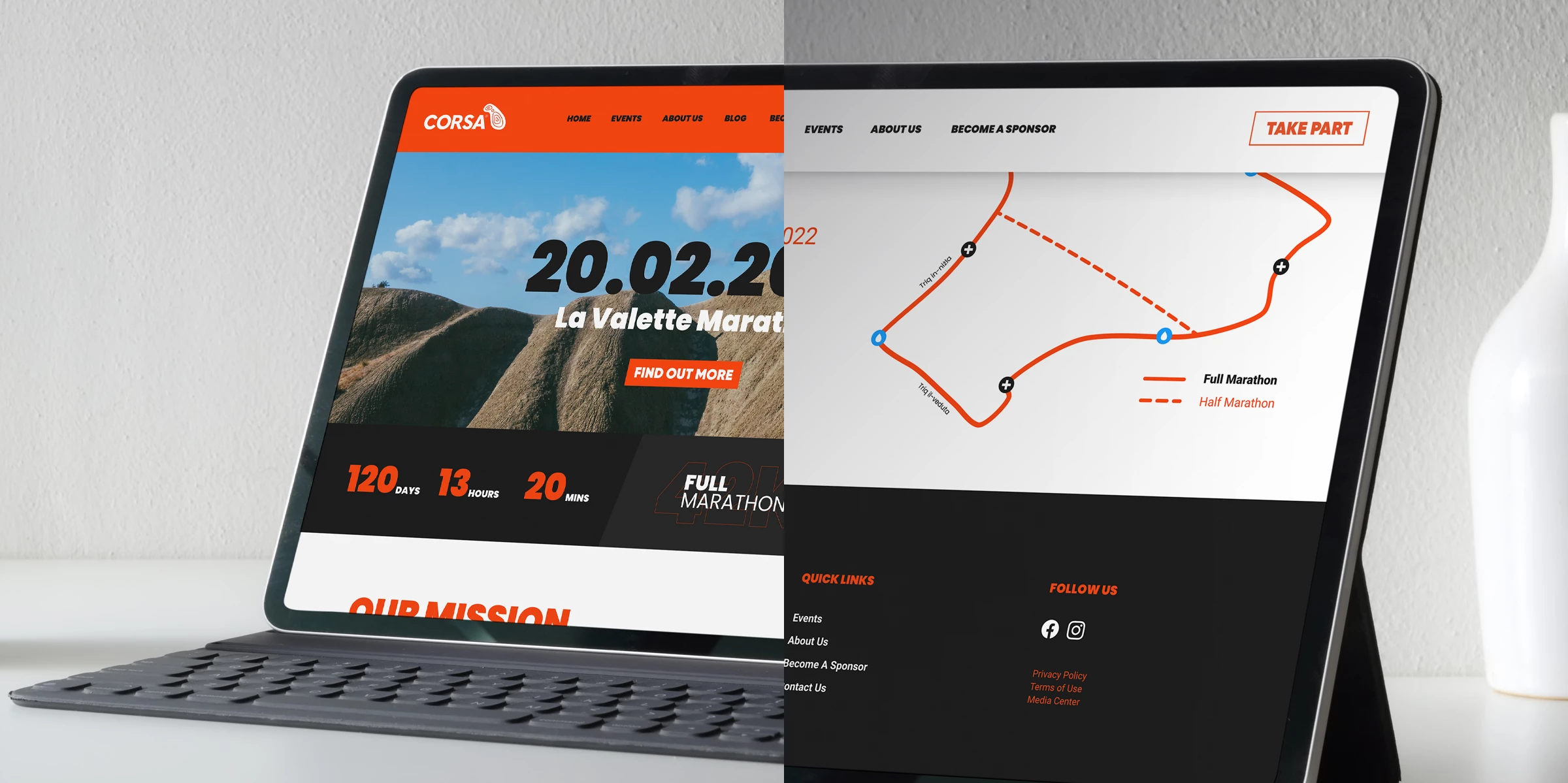
The Corsa website is built to house all Corsa and Corsa-powered events.
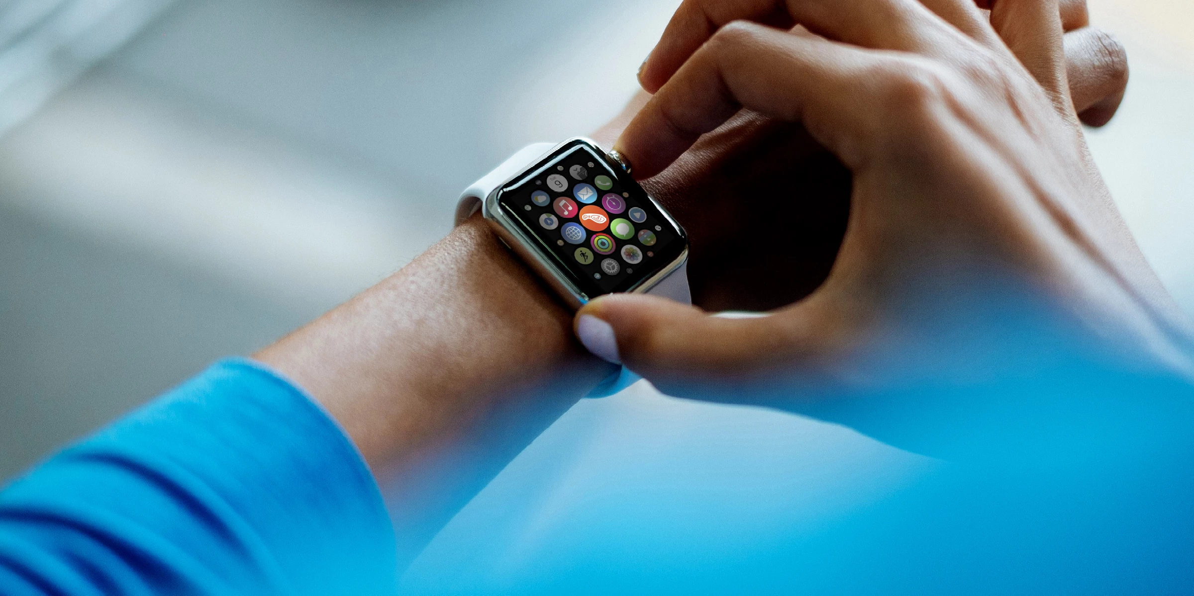
Every bit of Corsa collateral prioritises brand awareness and visual familiarity.
