
“I love the new brand visual identity. Switch made the process seamless and the results are stunning. I’ve done many brand exercises through the years in various corporate setups and this one was by far the smoothest and most enjoyable experience and super agile too.
I didn’t think we would be able to achieve the right deadline but we did. The team was super supportive and understanding of my needs and delivered excellent results that truly emanates my vision for the brand”
Nitasha Sewwandi,
Chief Marketing Officer at Bluestream
The brand
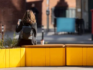
Bluestream is a global leader in urban outdoor furniture. Their range of modular products gives unprecedented access to urban planners and designers in the form of hard-wearing and sustainable products – from street furniture to play equipment and from smart city installations to expert waste management.
Having added such a remarkable spread of products in place over the past few years, it was time to revisit the way the brand was presented.


The brief
The project started with a very defined and business-driven brief. The brand and product positioning was excellent while the visual identity and assets could do with a refresh to support the excellent positioning.
Our task was to reimagine the Bluestream visual architecture in a way that narrowed this gap. Additional concerns were with the spread of visual assets that the brand required – these had been added as the brand grew and could benefit from being more coherent.
Our mandate was to create a visually cohesive brand architecture and to document it in a way that would future-proof development of all new assets.


Our process
We promised a very complete brand manual, one that is an exhaustive guide for all present and future brand applications. And we promised it on time and on budget. This is where sprints come to the rescue.
We work in sprints. Each sprint delivers a pre-determined set of deliverables within a specified timeframe and to a defined budget. This keeps the work flowing and the cost predictable. It also allows for judicious expansion of the project scope and scale should the client require it.

The identity
The logo itself was initially excluded from the scope of works. We worked with the client to allow a gentle reworking of the logo to keep it visually familiar while giving it the polish it needed to form the centrepiece of the identity.
For even more flexibility, we introduced modularity that would permit the identity to work in banner, stacked, and identifier-only contexts. Having an updated foundation to work with, we moved outwards to explore all other aspects such as colour palettes, typography, iconography, and application to 2D and 3D assets.


Colour consideration
Primary and secondary colour palettes form the mainstay of the brand and product hierarchies. We were true to the heritage palette for all parent brand applications while adding a beautiful secondary palette for all of the brand’s product stream communication.
This preserves the familiarity of the brand with its stakeholders while adding a new way of telling the brand stories in a palette that’s consistent with the brand’s personality – a connection with nature and respect for its complementary colours.


Constructing the context
The core brand identifier formed the basis for all graphical elements. Containers, used for anything from photography to data visualisation, use the gentle curves inherited from the identifier. Iconography follows the same visual language.
Building from the ground up allowed us to create a deliberate and consistent design language upon which current and future elements can be built. This goes beyond the immediate need to present a full suite of visual assets. It gives the client a solid basis for development of their brand in a way that’s independent of their relationship with Switch.


Any type of text
The brand is based in the UAE so, while latin script carries most of their communications, we needed visual consistency with anything written in Arabic.
With an intriguing blend of serif and sans serif typefaces established for the brand, we found typefaces that would work perfectly when Arabic language would be used. Typefaces from one type of script to another need not be identical but they should bear the same characteristics. The resulting collection does just that, creating visual consistency while allowing for the nuance of each form of text to shine.

Practical photography
Professional photography is beautiful. And costly. We created photography guidelines that can be followed by installers and delivery persons so that the brand can have a library that looks great without costing too much.
For each photography need, we carefully described angles, time of day, framing, crops, etc in a way that anyone with a smartphone can produce shots that work for the brand. They might not be perfect every time but they will allow the brand to build a large library from which to choose the best shots.


Laying it all out
The next piece of the puzzle was creating a set of grids and layouts that could work for all possible applications.
We explored all assets that the brand used and created extensive sample layouts for:
- Product look book
- Editorial publication
- Product catalogues
- Stationery
- Event branding
- Website
- Social media profiles
- Social media posts
- Email newsletters
- Presentation slides
- Technical documents
- And more