Have you heard about The Hub?
A few months ago, Switch was approached to help with the initial spatial design for a fresh concept in workspaces.
The Hub were planning to offer a range of unconventional options for the modern business for short- or long-term solutions.
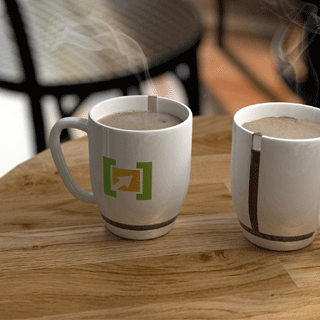
It had to be contemporary and it had to be flexible. The Switch design team got cracking on the general identity, logo design and stationery as well as all the iconography for the office signage. Before long, it was shaping up to be a pretty exciting space.
![]()
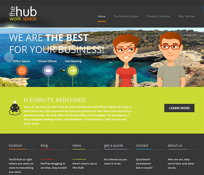
While work at the office was underway, The Hub needed to get its online presence up and running in preparation for the big launch. That’s where we come in.
The client needed a simple and user-friendly website; a platform on which to showcase the wide range of services offered to their target audience of businesspeople. That was our brief, and the key word in that brief was “businesspeople”. We could have experimented with a million different approaches for the site’s user experience, but none of it would have made sense to the site’s target audience. Businesspeople are busy people – the last thing you want to do is waste their time as they try to navigate through the website. For this reason, we stuck to a straightforward, if stylish, layout.

Results
The site was ready to launch within a couple of months, and once the offices opened for business we received very positive feedback on both projects. All in all, a great project to work on – and thanks to everyone at GX4 Projects for being such great clients!


