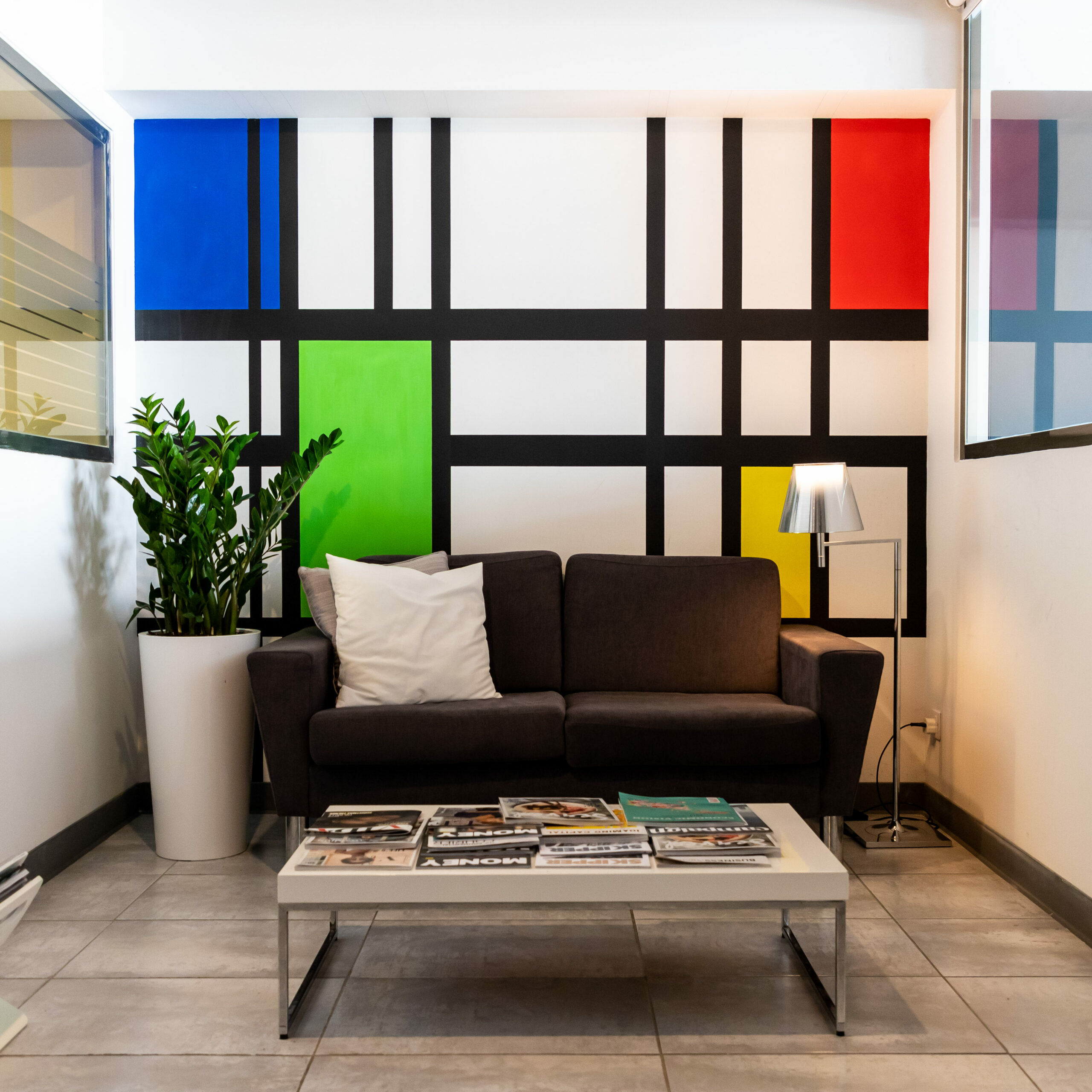
There is one wall in the office that’s unlike all the other walls in the office. As soon as you come in from the front door, before the reception desk, ahead of the boardroom, there’s a wall made up of eyeliner-black lines and splotches of colour: sunset red, holiday-blue, Sort-It-Out Green, and the kind of yellow that usually means you need to stay inside between the hours of 2PM and 3PM to avoid heatstroke. As far as walls go, it fulfils the purpose of making sure there isn’t a gaping hole in the building, and we don’t fall into Levantina next door during coffee hour.
As far as design goes, it makes us happy.

Bear with us, there’s a point in this.
There’s something about walking in in the morning and getting a faceful of primary colour that shakes you awake. Forget the Lot 61 coffee and the smell of Busy Bee bakers busy-beeing their croissants out into the open, the Mondrian wall is the catalyst for the Monday Morning Inbox Purging, the last thing you see on a Friday before Drinks With Friends. It’s design that makes us happy, so people gravitate towards the Mondrian wall like fish to the main road of Xemxija.
Alessandro Mendini: A Directive
Design that makes us happy.

Lately, there’s been a tapering-down of design – neutral colours, soft palettes, gentle couch-swooning, pearl-clutching elegance. Everything luxe is white and pearly-smooth; everything fashionable is cream and sandy gold, with the odd pop of blue or green or yellow. From makeup to clothing to interior design and exterior design, colour has (mostly) taken a back-seat, and design has softened its edges, and gone smooth on all sides. Everything designed has a purpose; everything designed needs to send this message, and that message, and that vibe. Design needs to serve a function; if it doesn’t serve a function, then it isn’t designed, it’s nothing, it’s to be swept aside and torn apart, and try again until you get it right.
(Writing has the same function – people don’t want to read writing that doesn’t have a hook, because time is money, and time is short. And, hey, half the time we understand: clients want their money’s worth, and design and content need to be optimised to give them that, and that’s where we come in. We make design and content fun; we make design and content that makes us happy, makes you happy, makes everyone happy.
We design content we love).
This week, we’re dedicating this blog post to Alessandro Mendini, who designed what he loved, and pioneered Radical and post-modern design. He passed away last week, leaving behind a legacy to live up to.
The Anna Corkscrew

It’s a corkscrew in the shape of a woman that lifts its arms in a ‘hurrah’ when used. What’s not to like? Mendini designed it in the likeness of Anna Gili, a performance artist and installation designer; it’s a happy corkscrew that’s celebrating with you, ready to ferry wine into glasses for you and your friends.
The Proust Chair
Tiny squares of colour holograph into each other along the shape of a Baroque arm-chair. It’s referencing at least three different time-periods, and six other art-forms, but it works: the shape goes with the colour goes with the name goes with the style.
The Groninger Museum

One of the three main pavilions of the Groninger Museum, the yellow tower is the brightest thing for miles. Catch it right in the morning, and the sun-glow off it is enough to blind, but grey days are no match for a building designed with ‘happy’ in mind.
- The Ramun Lamp
It looks like a science project, but the Ramun lamp is a landmark in experiential design: three rings were chosen to enhance the LED lighting and give complete uniformity, no matter what position the three rings were in. The colours were chosen just because.
That was the foundation for a lot of what Alessandro Mendini designed.
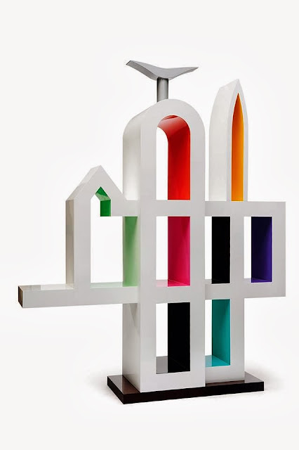
San Francisco

A blank white bookcase, pops of colour on the inside, shaped like a skyline. There are easier ways to design things, but be honest – this one sticks in your mind.
A thing of beauty…
John Keats wrote ‘A thing of beauty is a joy forever’. Alessandro Mendini embodied it – in the way he looked at buildings, furniture, objects d’art and objects of use as the same amalgamate categories of ‘I’ll do what I want’. In design, it’s form and function, it’s look and use, but it doesn’t mean that you can’t have fun with it, slip a little bit of colour where it could be grey or black, use a shape that doesn’t normally get used. Timeless white and angular sofas have had their heyday, way back when the century turned and apartments soared, and buildings had more light, more room, where everything needed to be like the magazines, and so clear you’d stain it if you take a breath.
And then there’s Mendini.

Mendini, born 1931, lived through the war, started as an architect and decided that that wasn’t enough. He decided he wanted more, so he edited a magazine and designed armchairs; he looked at his friend’s silly smile and emblazoned it on corkscrews and plates.
Alessandro Mendini had fun with it.
He designed what he loved, up until he passed away in 2019 with the entire long colourful history of his design behind him. He suggested that commercialism and consumerism isn’t a bad word. Designing for fun doesn’t have to be different from designing from a purpose. Adding colour isn’t bad. There are more shapes than are dreamed of in your philosophy, Horatio.
Design bold. Design bright.
Marketing agencies who design and build brands from the bottom up are bound to what their clients want to do; at the end of the day, our business is helping people make decisions they’re happy with.
However, it doesn’t mean that design has to be toothless and safe, white-space and pared down. Be bold. Think of what you love. Tell us your favourite colours. Trust us.
We’ll design something you love.
Rest in peace, Alessandro Mendini.
Thank you for the inspiration.


